

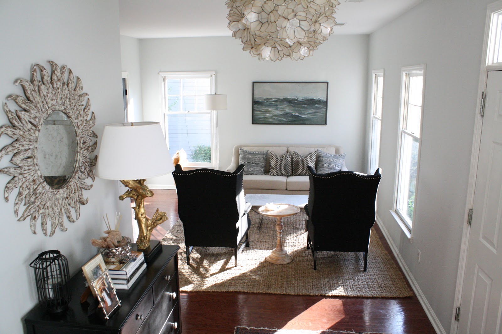
I do like how you see more (pillows, coffee table) with the black chairs facing the wall, but I can't get past the feeling of two huge tall black holes right when you walk into our house. I'll put on record that I'm in the "black chairs against the wall" camp (original layout).
But.. let's see what you think, shall we? ;)


EDIT:
I angled the chairs! It definitely does seem to make it better, but I'm still so undecided!
Also a couple notes - I was thinking of putting a console table behind the sofa if it's facing the wall (original way). I think that would help it feel more interesting. I've also tried rotating the furniture 90 degrees, but it's very tight with the doors opening and closing. Also, the rug won't fit the other way.
I did this quickly because I have to run out the door, so things are a bit off centered..


Also, this arrangement will be interesting.. before the black dog sat on the black chairs and the tan cat sat on the tan sofa so it worked out as far as pet hair. Now it's going to be flipped. Eek!


I vote for the chairs against the wall. I think it keeps your eye moving through the space to break up the black dresser and the chairs. In the other arrangement, it feels unbalanced. Love what you've done with the space!
ReplyDeleteTeam Sofa Against The Wall!
ReplyDeleteCan the chairs be put a little side ways instead of facing the wall straight so you can see more of the couch? I think the couch on the wall opens up the room more but see what you mean about the black holes.
ReplyDeleteSofa against the wall!! Looks more inviting :) Plus the black doors and the black chairs draw your eye nicely diagonally accross the space when first entering the home. You could put a fig tree (Jenny recommends Ikea for them) just to the left of the entry to soften the "black holes".
ReplyDeleteI like it the new way, but can see your point about all the black at the entry. The chairs have a nice back to them though. And it definitely opens the space up more.
ReplyDeletePersonally, I'm not really a fan of the couch or the chairs right when you come in. I feel like it makes the space less inviting. Like you have to make an effort to go around the couch to use the space. Could you put the couch against the wall and then put the chairs at more of an angle across of it?
ReplyDeletePretty room! I'm with Valerie -- angle the chairs toward each other a bit, but leave them as is. The sofa looks so stately against the wall and it does make the space seem larger.
ReplyDeleteSofa against the wall. But could you angle the chairs so they don't look so stiff and uninviting? I think it would loosen the arrangement a bit. Otherwise, I love it. And I agree with the commenter who talked about bringing some green in with plants.
ReplyDeletei like it switched, sofa seems too heavy or blocking the flow where it was. Looks awesome!
ReplyDeletesofa against the wall is 200% better! i would even break the chairs up. move your lamp to the corner on the other side of the sofa, and put one of the wing backs on the other side of the sofa angled in with the small side table between the chair and sofa. keep one wing back near the wall with the windows, angled in and sort of diagonally across from the other chair. mix in that smaller chair even or the stool next to the dresser. there's no rule that the pair has to sit side by side. and i'd still try the rug the other way - hard to tell if it will fit in the pic, but running it the opposite way goes more with the flow of the space. good luck!
ReplyDeleteI like the black wingbacks against the wall. Their backs are high so when you come in, the first thing you see are their backs and it is a little jarring. The height of the sofa back is lower and less in your face.
ReplyDeleteThe sofa against the wall gets my vote as well! It completely opens the room and then you get to see the GORGEOUS silhouette of those black chairs and the detail of the nail-head trim. Once you have window treatments in, your eye will be drawn up as well and the chairs won't look like black holes. I think this look is fantastic!
ReplyDeleteDefinitely sofa against the wall!!
ReplyDeleteLooks nice either way, really! What if you put the sofa against the wall and added a gold tone pillow, putting 2 of the blue pillows in each black chair? It'd tie in the colors of the foyer and the living room a bit while avoiding the look of a squared off space that the sofa sort of creates.
ReplyDeletei vote for the arrangement you didn't try... couch on edge of rug with the french doors behind it, and chairs in front of the windows. or, chairs with french doors behind them, couch on wall with windows.
ReplyDeleteChairs against the wall. I see what you mean about the black holes when they face the wall. But I feel like maybe they need some lumbar pillows or something... I loved seeing the pillows on the sofa when it was against the wall.
ReplyDeleteDigging couch against wall but I like both ways, rooms are meant for rearranging furniture every year to keep it interesting!
ReplyDeleteI vote couch against the wall but its your home so you should do what makes you happy. What about breaking up the chairs and putting them across from each other with one inbetween the window and the other across from it on the other side of the coffe table and using the round table next to one of the chairs?
ReplyDeleteI like couch against the wall for the reasons others have stated. Have you ever tried rotating the current arrangement 90 degrees? Crazy I know! Just curious on what that would look like.
ReplyDeleteI think the light colored sofa gets lost next to the wall. I like both arragements but what if you but if you put the sofa with the back to the door i think you need a skinny sofa table behind it to cover up the blankness of the sofa. Something fun and light to balance the dark piece that you have when you first enter. I think it would be a great addition to the room. Either way i love that space.
ReplyDeleteI also vote chairs angled toward each other a little bit. And I do like the suggestion to face the couch toward the windows and have the chairs facing it. But that would mean moving the furniture around again:-( anyway, it looks awesome either way.
ReplyDeleteHeidi
www.therusticmodernist.com
Sofa against the wall or put the wingbacks in front of the front windows at an angle and the sofa across from it (with its back to the french doors). Oh and if you leave the sofa against the wall I would angle the wingback chairs. That's my two cents!
ReplyDeletelove the sofa against the wall. wish the chairs weren't solid black though.
ReplyDeleteI much prefer the black chairs in the middle. I know you said it feels like a black hole to you, but I feel like it anchors and balances the room. Before, you had a light sofa that disappeard from the back and then lots of black on the wall. With the chairs in the middle, you have a balance because of the pillows and the frame on the artwork. Also, it looks more inviting, like someone is welcome to sit there rather than feeling a bit too much like a furniture vignette. LOVE the chairs on an angle!
ReplyDeleteSo much better with the angled chairs!
ReplyDeleteoooooh the console table behind the sofa sounds perfect! :)
ReplyDeleteI like sofa against the wall, but both look good!
ReplyDeleteI like the sofa against the wall. I think it makes the room seem bigger and more open.
ReplyDeleteI like the original way the best. Move it back :) !!
ReplyDeleteI like the sofa against the wall. There is more of an open flow with that arrangement. Strangely, I wouldn't have thought about it before, but now that I have seen it both ways, I would keep option 2.
ReplyDeleteThat's a hard one, I see what you mean. But I vote for the sofa against the wall. You could break up the 'black hole' but hanging a throw over the back of one of the chairs. Also, I think when you get your curtains up it won't feel so black hole-ish.
ReplyDeleteCouch against the wall, but would also be interested in seeing couch against the wall, chairs in front of black doors (angled). Seems like it might be pretty and open when you walk into the room. Couch in front of doors and chairs in front of window also sounds nice. Pretty room.
ReplyDeleteI love the new layout with the chairs at an angle, but I do understand your comment: "...but I can't get past the feeling of two huge tall black holes right when you walk into our house." My crazy suggestion would be to upholster the back of the chairs with a coordinating patterned fabric (maybe something like the pillow fabric). Loving this room so much more in the new configuration.
ReplyDeleteDefinitely like it switched! My eye loves it!
ReplyDeleteHave you tried them in front of the French doors . . . still on the rug? I think it might open up the room more.
ReplyDeleteThe chairs the way you have them now, guests might feel, "where do I walk" to get in the room.
Love your sofa, pillows, and black chairs!
It looks so much nicer the new way. Much more visual interest. Nail head trim! Pretty pillows. Happy doggy!
ReplyDeleteplease leave it this way for a while....for us!
jbhat
definitely the black chairs facing in the room. and the couch against the wall. you can always throw a blanket or somethign over one of the winged chairs to keep it from feeling like 2 black holes.
ReplyDeleteI kept changing my mind every other picture, so I guess I don't really have a vote. Go with what YOU love and it'll be the "right" way :) Love everything in the room, regardless of where it is!!
ReplyDeleteOh I LOVE it with the black chairs in the middle and angled. It's gorgeous. It takes away the boxy, formal feels and makes more interesting angles and textures. I don't think it looks like black holes at all like that. You can see the nail head better, and all the patterns of the pillows make sense with the dark chairs. With the chairs angled the room is much more welcoming, like the room is giving you a hug and asking you to come sit down. :)
ReplyDeleteI left a quick comment on your instagram, but chiming in here as well - I prefer the new arrangement... however, I could be swayed with the addition of a sofa table. Right now the sofa actually reads as a big wall to me when it's the divider, whereas the opening between the chairs draws your eye past them and into the room. But a sofa table could help ease the transition...
ReplyDeleteCouch against the wall with angled chairs!!
ReplyDeleteI think it would look great, and a bit more conversational, with the sofa on an angle (sort of the original spot, but oriented towards the corner of the room, and the chairs located at a 90 degree angle to one another, so one is next to each window. Regardless- I really like the chairs angled like the last photo.
ReplyDeleteSince you're playing with it, try the sofa in front of the two windows and then the chairs angled in front (would be beter with the rug)...you could have a narrow piece on the wall with the art..if that doesn't work keep the chairs out in the room
ReplyDeleteI like the chairs against the wall. The sofa disappears into the wall and looks oddly small when the chairs are in the center of the room. Love your style!
ReplyDeleteI love the chairs, but IMO they feel way to big for this room, they overpower the space and the sofa. I would use them somewhere else in the house and put two small patterned slipper chairs there, at an angle though, to feel less "waiting room" and more living room.
ReplyDelete+1 to sofa in front of the two windows -- or even chairs in front of windows and sofa in front of french doors.
ReplyDeleteI want sight lines from seating to the main entrance.
Backs to the door = I'd always wonder "is there an axe murderer hiding that wingchair" when I came in (or "did an axe murderer just come in the front door" if seated in one.) (It's also possible that you/your guests are less neurotic than I, lol.)
Oh no, I like the chairs against the wall. They are too tall! The people on the couch can't see over them and the people in the chairs will have a hard time twisting around to see the front hall. Just my opinion...
ReplyDeletelove the new layout! looks beautiful! also - can you post on the pillows? love them!
ReplyDeleteI vote for the sofa against the wall with the chairs angled. Looks great!
ReplyDeleteI love the new arrangement. I always thought the chairs looked a bit awkward on the wall, a little too much contrast maybe? I like the chairs set at an angle a lot! And regarding the "black hole", I don't see it, I think the nail-head on the chairs creates enough interest to break up the black. Would it be weird to do nail-head around the bottoms of the back & sides of the chairs to add even more interest? I'm not sure if I've ever seen that before, but might look cool!!
ReplyDeleteI like it with the sofa against the wall. It's better with the chairs angled. Could they be angled a little more?
ReplyDeleteEither way, it looks great!!!
What about sofa in front of windows, chairs in front of french doors?
ReplyDeleteIt's a tough call- of course do what feels right to you. I do feel like the black chairs are much more interesting to look at from behind (they've got a beautiful shape!) than the couch is. A sofa table would really help with this though, so if you could do that without crowding things that might work.
ReplyDeleteI'm liking the new layout actually. The height of chairs and sofa seems more balanced this way. I know you're scared they look like black holes, but the overall room is pretty neutral and I think they feel a little more dramatic (in a good way) with this layout.
ReplyDeleteSofa against the wall!!! I love it. The painting comes to life with those pillows. And Something about the new set up looks far more expensive and designery to me.
ReplyDeleteLive Inspired,
Heidi Chamoun
Athousandlaughingstarfish.blogspot.com
I like the sofa against the wall by far. Your room looks lovely and your dog is adorable :)
ReplyDeleteI like the sofa against the wall with the chairs angled. It opens up the room more and you're not staring at the back of a sofa when you walk into the room.
ReplyDeleteI do like it better this way, angle the chairs a bit more? But---how much do you love the chairs? They might be too big and black anywhere you put them.
ReplyDeleteLike the arrangement. Much cozier to be sitting against a wall versus it being wide open behind you. The wings act as walls also. Another arrangement could be moving the chairs so one is on either side of the sofa- so that you could reach the coffee table. Two ottomans could be added in the wing chairs place to act as a drop for a purse when entertaining, or for additional pull up seating. LGN blogged about a pair of ottomans today.
ReplyDeleteI really prefer the couch against the wall with the chairs angled. It looks great! Adding a light throw over the back of one of the chairs could brighten things up, but I don't think you need it. I love the idea of a sofa table against the wall too. You did a great job accessorizing the top of the chest in the entry way. Very chic.
ReplyDeleteI think that the chairs closer to the door looks more open and inviting. With the sofa out in the open it just sort of looks like a big blockade. Have you considered placing the sofa a little ways out away from the wall, but in front of the windows? The best suggestion I've ever seen truly work in home arranging is to keep things off of walls, using rugs to make a space and keep it intimate.
ReplyDeleteI think angling the chairs made a huge difference! I also think the console idea is great -- the back of the sofa is a bit too stark and I agree with you that the chairs are a little heavy to place at the entrance of the room. A console could add warmth and interest. I love your entry table, btw. Beautifully accessorized!
ReplyDeleteSofa against the wall...love it! Your room looks beautiful.
ReplyDeleteThe chairs placed in the middle of the room on an angle looks ten times better!! I think it makes the room look bigger and not as boxy. The sofa against the wall compliments the painting and floor lamp much more than the chairs did!
ReplyDeleteI prefer the sofa against the wall and the chairs angled. Another option would be to try something in front of the window- maybe the sofa there? I think in a perfect world you could keep the sofa against the wall and get smaller chairs for the other side.
ReplyDeleteSofa against wall for sure! I like the way the picture looks better above the couch than the chairs. I agree though that the chairs look better angled.
ReplyDeleteI think you should try the sofa in front of the windows {in between}, with drapes it would be fine and then the chairs across from it at this angle. I prefer not to look at the back of any furniture when you look into a room {and I am assuming this is the view from your entry?}. Just something to try???
ReplyDeletexo~JIll
Like some others said, I think you should try the sofa in front of the two windows and the two chairs in front of the french doors. I think it might even open up the space. Love all the pieces you have picked.
ReplyDeleteI like the chouch on the wall with the chairs angled. I think the wall felt kind of cold and stark before with the black chairs and cool hued artwork on the white wall. The sofa brings warmth to the wall and the dark chairs balance the dark art. No more dark cool side and light warm side. I like how the chairs kind of frame the view of the sofa, pillows and artwork when you look between them. The angled chairs open it up a bit and make it feel a little more cozy and a little less formal (more inviting). My vote is definitely for the new arrangement. But if you went with the sofa table idea I'd go skinny and dark to balance the room and add some warm pillows to the chairs.
ReplyDeleteI agree with Audrey and Jill, and would love to see that arrangement too (if you had any energy left after the second switch) :)
ReplyDeleteI like the couch against the walls with the black hole chairs in the middle of the room. That being said, I think all it needs are two matching throws in a light color. Maybe cream pashmina's even draped over their backs to make a big stripe down the back. That's what I'd do anyway! Love your style so I'm sure you'll make it all sing!
ReplyDeleteGorgeous! I love seeing the pillows.... what would happen if you moved the painting down about 6 inches, installed fabulous curtains to give some texture, and maybe added add in a throw to soften the look of the black chairs... you are so right about how much more difficult to arrange our own spaces!!! Your pup looks happy with the new arrangement too!
ReplyDeleteI like the sofa against the wall. You appreciate the lines of the wing chairs so much more when they're floating in the space. Good luck!!
ReplyDeleteanother thought...what about swapping the black chairs with the two chrome chairs you have in the family room. the family rooms size looks like the black chairs would work better in there and they look like they might be more comfortable for tv watching etc.
ReplyDeletethe sofa in front of the windows for sure, better feng that way and the room would feel much more welcoming. curtain panels on the outside of the two windows and two panels on the other window. then the two chairs would be in front of the french doors and you could use the wall that held the sofa to do so many things...try it!
ReplyDeleteWhat about losing the chairs and trying your old chaise in their place? Or maybe go down to one chair angled?
ReplyDeleteI tried to read all of the comments...but got impatient. If I were you I would be crazy by now. This may have already been suggested but.....and you may have too much of a symmetrical eye for this....what about splitting up the chairs? I love the sofa against the wall....but try putting a chair to the left of the sofa [as you look at it]. Maybe scooch the left over chair in a little with the small round table beside it and the tall lamp near the window. Then....you hate me yet? Since you don't have any skirts on the furniture a skirted table in between the sofa and chair with a nice big lamp on it? You can delete all of this if you want....just thinking out loud. Don't get me wrong...I love everything in the room and I think you can make it work once you have the curtains up and it is all layered! I love your style.
ReplyDelete