

BEFORE
(You can see in this photo below I have all the lights on and it still is pretty dark)
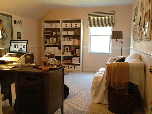
AFTER


I am so happy with it! The color is still pink, but it's so nice and light. The pink is very subtle.. I think my husband thinks it's a cream color.

It's Opal by Benjamin Moore.
Like my tissue box in the last photo? I was alternating.. paint, blow nose.. paint, blow nose... I'm pretty sure I have a sinus infection. :(
I have been so indecisive about my office for so long.. I just want it done! I finally had an "ah ha!" moment the other day. I realized the reason I couldn't commit to a design direction was because I do so much design IN this office that I subconsciously didn't want it to feel overly decorated. Does that make sense?
So it's going to be white and neutral everywhere with "pops" of color (ugh I hate that phrase so much). I guess sort of like this but on a much smaller scale:

[via Rue Magazine]
Just a couple more things to do... I'll have an final after soon!


It is amazing what a coat of paint can do! Your office is beautiful and feminine!
ReplyDeleteLooks great and much brighter! I love that color. Can't wait to see the finished product!
ReplyDeleteLove it when the 'ah ha' moment hits! It's looking great. Hope you feel better soon, Bryn.
ReplyDeleteLoving this paint color! It is all coming together quite nicely. So excited for you!
ReplyDeleteSorry you're under the weather :( but on the bright side the room looks amazingly brighter with the new paint. It made a big difference. Can't wait to see the final product.
ReplyDeletePs. Instead of "pops" of color, how about slash or hints of color? Haha just trying to help avoid that much hated word.
Ok. I really need to stop commenting from my phone. I meant Splash NOT slash of color if anyone caught that above. Got to love spell check.
ReplyDeletethe new color looks really great! love those a-ha moments!! can't wait to see the finished product :)
ReplyDeleteI'm glad to hear someone else hates "pops of color" - terribly overused expression, especially on HGTV design shows! Love your opal.
ReplyDeleteI just saw that office in Rue last week and loved it as well. I noticed a lot of Expedit pieces from IKEA. Your paint color does brighten the space. Nice difference!
ReplyDeleteLooks great! Can't wait to see more.
ReplyDeleteI am loving this new wall color! Good job on convincing the husband to help:)
ReplyDeleteWow, what a difference that color makes. It looks so much brighter. And, I love your inspiration picture.
ReplyDeleteBryn, I completely agree with your comment about spending so much time in there decorating, it doesn't seem appropriate to have the space overly decorated!
ReplyDeleteI'm in the same predicament with my small office right now. The walls have white and light gray ticking wallpaper and the floors are painted a faint gray blue (nearly white). But I'm thinking the oriental rug and heavy army green campaign desk need to go. I'm favoring a neutral palette that won't compete with the projects I'm putting together for clients.
Love the new color. Can't wait to see the afters.
Live Inspired,
Heidi
athousandlaughingstarfish.blogspot.com
I'm new to your blog. Nice color choice. Can't wait to see your finished office. I'm in the process of working on my home office as well. Hope you feel better!
ReplyDeleteI love the new colour and the old one (just maybe in a lighter space :). Would you mind sharing the old colour swash and the fabric name of your blind with all your beloved readers?!!! I have a very light room and am looking for a great pink!!! Thank you!!
ReplyDeleteHey Bryn - everything is looking good! It's coming along fast!!
ReplyDeleteI tagged you in today's post... sorry if it makes you roll your eyes (I know most children of the 90's could cut someone if they ever see chain-mail again)... but who doesn't like to talk about themselves secretly? ANDDDD I'd love to get to know you better. Check it out :)http://www.powellbrower.com/2012/03/tag-youre-it.html
Love it! Light and bright, can't wait to see it all come together! Love this office, especially that turquoise lamp and the pops of color everywhere!
ReplyDeleteI would love to know where your laptop stand is from
ReplyDeleteAmazing how the color is only slightly lighter and yet it completely opens up and lightens the room. I may look at this color for re-painting my kitchen
ReplyDeleteI love a great office space, and this one is coming along so nicely! and I love the great space from Rue, how gorgeous!
ReplyDelete