


[graph found via google images]
And the drop off point would be when our family left us.
Priorities have shifted to getting my office done. When I find free time, I put a coat on my office desk. It's a vintage mid century modern piece that came to me really beat up, so I did some patching and sanding and a couple coats of paint.
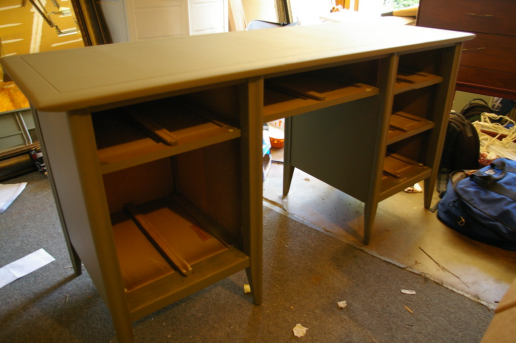
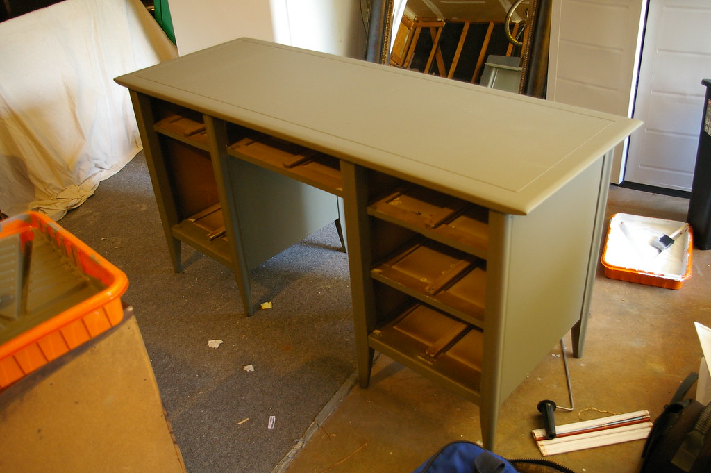
The color is Martha Stewart Falcon (mixed in BEHR premium plus ultra). It's the perfect Army Green with a bit of milkiness to it.

Originally I wanted a super gloss finish, but I've been liking the smoothness of the flat paint. So I will use Satin poly instead of Gloss to protect it. I still have at least two more coats of paint and a couple coats of poly to go.
Switching gears, I've also been testing cream samples in our master bedroom.
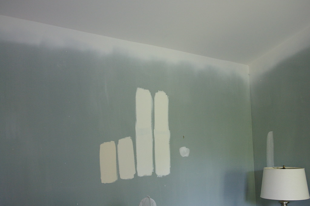
For at least a week now, I've been trying to decide between Sherwin William's Creamy (third from left) and Sherwin William's Dover White (first on the right).
I need to prime the walls before I paint to cover the blue/green, so I'm not sure when I'll get around to that.
The third space I've been actively working on is our master bathroom. There isn't much to be done in there, so I'd like to finish it up soon. I need to paint, add a couple wall shelves, add new window treatments, and then I'll be done!
Here are the wall shelves I think I'll be adding:

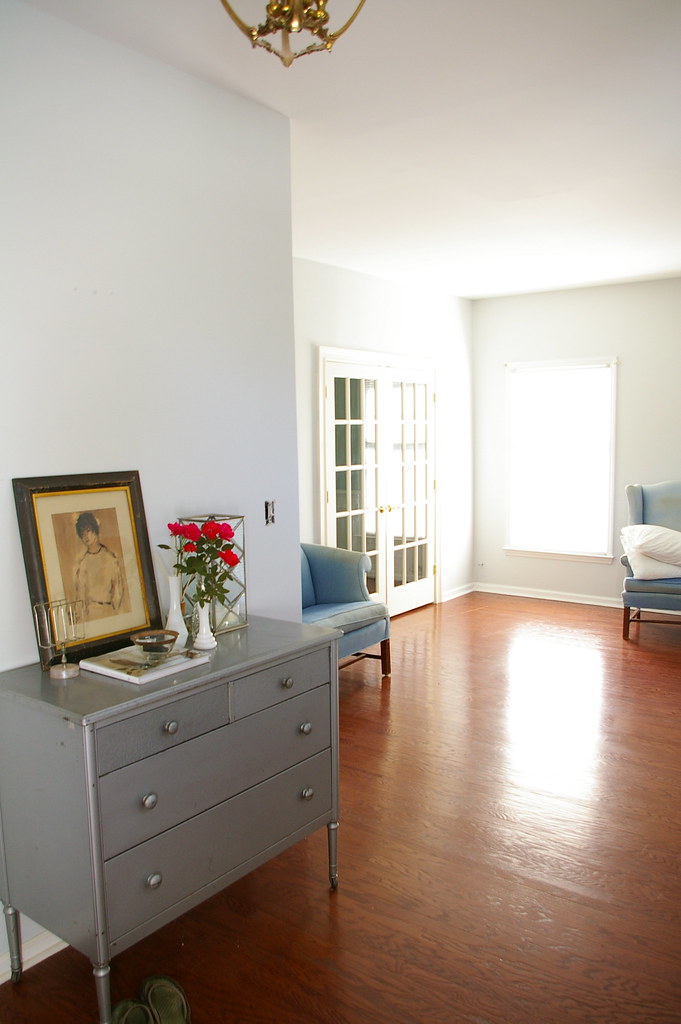
Even though our other spaces still look somewhat like a construction zone, I'm 'workin' with what I got'. Here is what our entry currently looks like:
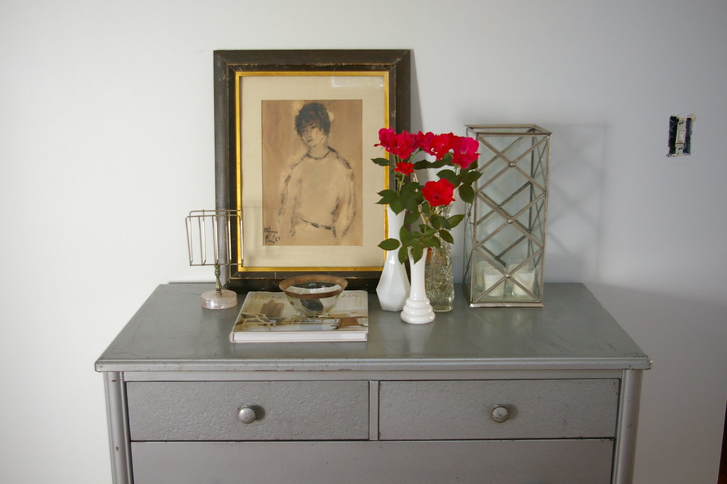
(Flowers picked from the only flowering plant we have on our property. They are a pretty color, aren't they?)
I'm debating whether or not to paint this piece black, OR have it professionally stripped down to it's original steel body. Similar to this:


What do you think? As much as I LOVE the original steel, I'm leaning towards black. I think it will contrast against the blue/gray walls better than steel. I can always sand down to original finish later down the road for a different use/room. Like a nursery!
So, that's where my head is at! Going in many different directions.
edit - I'm already getting votes for the steel! I sort of knew that would happen ;) I'm still leaning towards no steel.. here is a picture of the room. I'm feeling that the steel just doesn't "go" with the blue/gray. Please persuade me otherwise if you feel strongly for steel though!


Personally...love the steel look...
ReplyDeleteI lloooove that steel look.
ReplyDeleteIm not sure how much they charge to strip it but you could do it yourself using peel away. Less porous materials are a lot easier to strip than wood.
I prefer the black look. Also, like you, I love White walls. I prefer to "color" everything else with accessories (pillows, lamps, window treatments).
ReplyDeleteHi Bryn,
ReplyDeleteJust love your blog!
Have you tried a sample of BM Linen White? I use it all the time and it's a favorite. I am finishing a townhome in mostly cream shades right now and I'd be happy to send along some pics. I'll send a separate email...
CC
It's looking good!
ReplyDeleteI like the steel as well, but you're right that it's something you can change down the road. I have a four drawer black metal filing cabinet that I'd love to strip, but haven't taken the time to figure out exactly what will do the job. It seems like kind of a big project.
I'm with you on the black. I love black furniture, though. Go for black now, and like you said - you can always go with steel later.
ReplyDeleteLove the desk! and you've just helped me solve my master bath shelving issue! :)
I love the steel with the glass knobs on the inspiration pic. Its hot :-) But either would look lovely.
ReplyDeleteThe black would pop, but that steel is so unique and beautiful!
ReplyDeleteI think the black will stand out more, but the steel is so unique!
ReplyDeleteMy bathroom is painted Creamy and it's a great neutral. I use Dover White on my trim. Both are great color's but Creamy is more of a "cream" tone. Good Luck!
ReplyDeleteThe steel is pretty fabulous. It would look gorgeous with the blue and your floors. It just might feel monotone... but I love the steel look.
ReplyDeleteListen to me carefully... (even though you know I don't really know what I'm talking about...)
ReplyDeleteHave. It. Stripped.
I still like the steel look =) I think the steel against your blue/gray walls will look elegant.
ReplyDeleteA cream color that I really like is Creamy White by Behr. Here is a photo from Country Living:
http://www.countryliving.com/cm/countryliving/images/Living-room-after-picture-MKOVR0106-de.jpg
& here
http://www.countryliving.com/homes/makeovers/small-budget-makeover-0106
I hope you find your cream color soon!
I love the steel. Here is my persuasive argument: It will not contrast as much but I can’t help of think of the textural interest. Plus, it would be excellent in a nursery (want to see it there when this happens for you) and it would already be done. I don’t have children but it seems once baby is on the way, you are already stressed/pressed for time enough that you may not have time to strip it down at that point. Might as well get it done now.
ReplyDeleteThe acrylic shelves are excellent. (However, I’m a nerd for acrylic.) I believe you posted them earlier. CB2 has a larger acrylic shelf, the Format Shelf. I find it very tempting.
http://www.cb2.com/family.aspx?c=598&f=5225&fromLocation=search
I love the steel.
ReplyDeleteAlso - if you're interested in trying something different - use the Benjamin Moore Aura paint in your bedroom. It will definitely cover the blue color underneath and you won't have to go through thr trouble of priming first. I used one gallon for my 12x16 bedroom. It ends up being cheaper and less labor-intensive in the long run! I keep telling everybody about it because I've had great luck with it so far :)
Steel! It will make more of a statement. Anyone can have black furniture...you can put black with it in the form of a little stool or small chair. You can make it work with other accessories, mirror, etc.
ReplyDeleteAs for cream- don't go yellow. I did, in my living room. When the sunlight comes in real heavy in the afternoon, it glows & looks vaguely atomic.
For me I'd say no to dover white if it has a bunch of yellow undertones, I painted our living room a parchment color which in the day was lovely at night it looked awfull, I had to repaint. Good luck - I like either the steel or black.
ReplyDeleteWe've been through the cream saga... BIG TIME! We finally chose "smooth pebble" which i think was a SW color that we had mixed with BEHR paint... I now want it in everyroom in my house... To me is the perfect cream... Let me know if you want me to send you a pic of it....
ReplyDeleteBlack for the contrast!
ReplyDeleteI like the steel - even though the color may not stand out as much the sheen and texture of it will!
ReplyDeleteI think the sherwin williams creamy looks better from the image. It is much more of a creamy color with less of the peachy or yellow undertones the other swatches seem to have - but what we can see from that image may be totally different from what you see in your own room! I'm loving following you on this process!
Hello,
ReplyDeleteMy favorite cream color is by Behr called Pot of Cream. I love your blog!!
I have a question about your fab new desk. How are you painting it (because it looks great!)? I usually prefer to spray paint furniture to get an ultra smooth finish but there's such a limited color palette with spray paint and I don't own a fancy spray machine. If I knew I could get such a smooth finish with a roller I would feel so much better about my color choice for my bedside table project. Since you're right in the middle of it now I thought you'd have an opinion one way or the other. Thanks! Also, I have to say I really love the steel, but it's your chest and black will be lovely as well!!
ReplyDeleteNot sure about the steel, but I have the SW Creamy in my house and LOVE it!!
ReplyDeleteHi Bryn:
ReplyDeleteThere's no question that the steel look would be lovely. However, I have an old metal tanker desk that is painted that traditional gray you always find, and I looked into stripping it down to the bare steel. I was STRONGLY advised not to do so, as it would no longer be protected from the inevitable oxidation process and would rust much more quickly.
So my vote is for black. Whatever you decide, I have no doubt you'll create something beautiful - you always do!
Christi
I say go for the steel look - it will add some shine to the room and really will play off the blue walls well!
ReplyDeletei vote for the steel because it's so unique. you could find a rather cheap wooden version of that piece to paint black. seems sad to have it covered up with paint!
ReplyDeleteI vote for steel!!
ReplyDeleteThe room does seem a little pale and in need of a black grounding piece, so I would suggest finding a really awesome black round mirror to put above the steel bureau, or a really large black and white picture, matted in white or light gray (to match the walls) and a black frame.
Just imagine how gorgeous the steel bureau would look with a tray full of candles, sparkling and twinkling away on top.
OOh! I like the black look....:))
ReplyDeletemadebygirl.blogspot.com
I LOOOVE steel, but agree that black would look better in the room.
ReplyDeleteThat blue gray color is AMAZING! Can you share what color that is?
ReplyDeleteI vote for black... I think it looks better than the steel in the room.
ReplyDeleteHi Bryn, I adore your blog, it's so fun to watch you decorate your new home! My vote is for the dover white, I like the creaminess and it does not look yellow to me. Happy painting!
ReplyDeleteKelly
Steel. It will look great with the wood floors. And it's just so cool.
ReplyDeletei'd go with black. you can always strip it later.
ReplyDeleteThe black will contrast more with the walls than the stainless steel, but since your walls are so light I think it may contrast too much. I really like the look of the steel and think it would look perfect in that room!
ReplyDeleteSteel it is! I hear what you are saying about needing a contrast but the steel is notable and interesting. You need steel! (pull your black in with a rug or an extra large mirror framed in black)
ReplyDeleteOOOOooohhh, the vignette in the entry way is so cute! I love the dresser the way it is. But you can always strip it later on, for a little change.
ReplyDeleteMy entry way is a wasteland of boxes still.
Creamy is a contender for my cabinets. Love the steel, so unique.
ReplyDeleteThe steel idea seems lovely on paper but I think black would look better against your wall. Steel might just blend into the background and might run the risk of looking almost dull.
ReplyDeleteI would personally go for the black . It will really pop against everything else.
ReplyDeleteP.S. I <3 your blog!
I like the steel - even though the color may not stand out as much the sheen and texture of it will!
ReplyDeleteI think the sherwin williams creamy looks better from the image. It is much more of a creamy color with less of the peachy or yellow undertones the other swatches seem to have - but what we can see from that image may be totally different from what you see in your own room! I'm loving following you on this process!