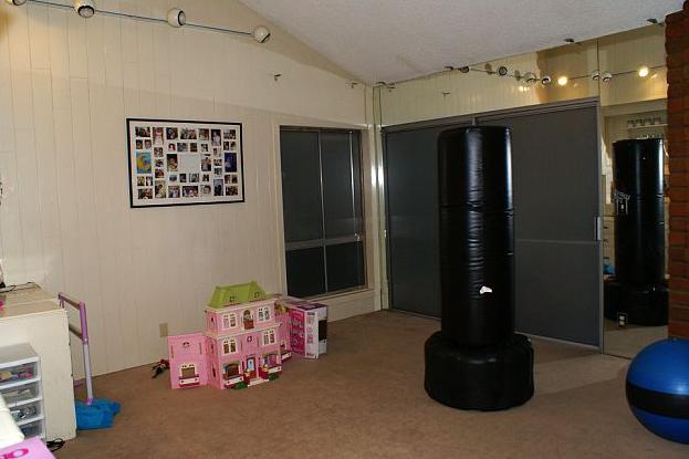
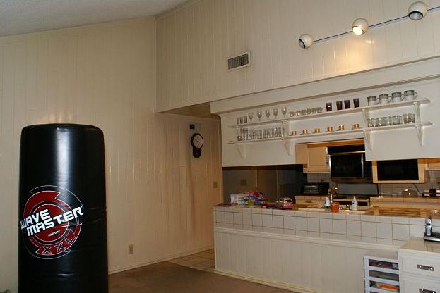
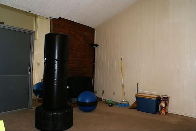
We knew the paneling, mirrors and track lighting had to go. I presented two options to my clients for the fireplace - paint the brick white, or remove the brick to create a flat drywall finish on the fireplace. I'm so glad they went with the latter, it turned out to be the perfect canvas for our shadowbox wall (will get to that later).
THANK GOD for my client's amazing contractor, who was a family friend of theirs. He was absolutely amazing and if I was still in California I would use him for all my jobs. All I had to do was sketch out my vision and he brought it to life.
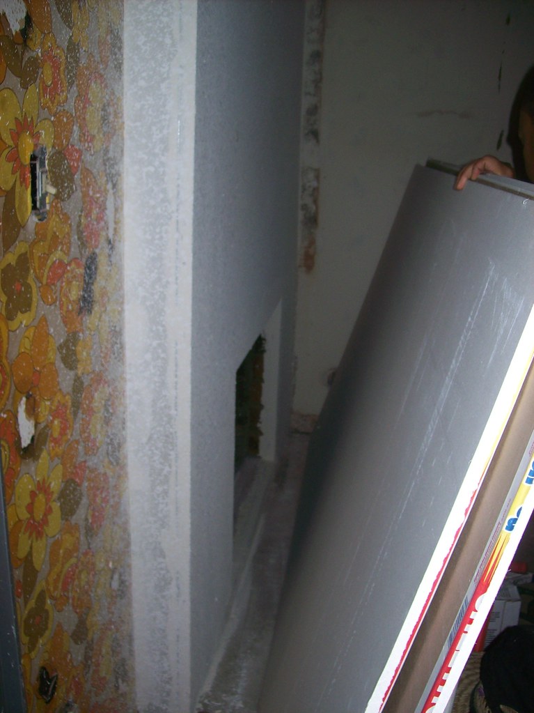
Here is a "during" shot - check out that vintage wallpaper! No wonder the home had mirrors and paneling up. (Although I sort of like it - wouldn't it be fun in a little girl's room?)
I like to create design boards for my full service design to help both the client and myself visualize the space. I usually use them for the core pieces (furniture, paint, drapery) and then add in the patterns and art later. Here is the design board:

Couch is from CB2, media cabinet is from IKEA, the pouf is from Taza Designs and the rug is from West Elm. The red silk drapery is from smartbargains.com. The pendant lights are from Bellacor.com and are for the adjoining kitchen (also seen below).
The paint color is formally from Martha Stewart at Lowe's.. it's a gorgeous blue/gray. I can't wait to see her new paint colors at Home Depot!
I blogged about finding the great Ikat fabric back in September:

Now on to the best part - the Afters!
The drum pendant is one of my favorite things in the room. It casts a candlelit like glow when on.
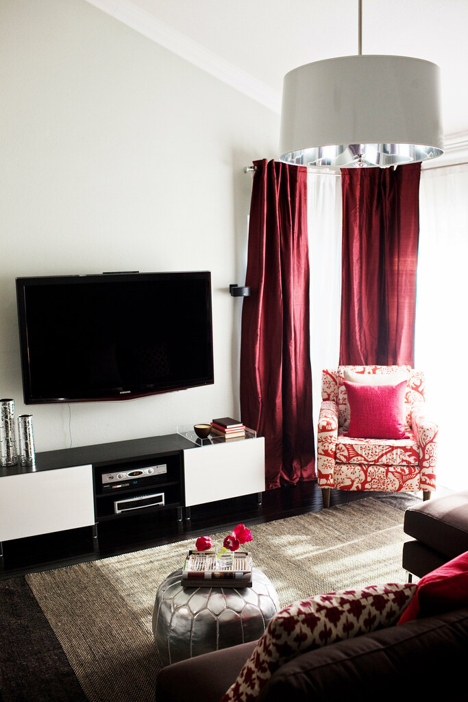
This chair adds great interest to the room - it's from Urban Outfitters. I like how the room is monochromactic, but there are two different reds involved - the bright red of the chair and the dark crimson of the silk drapery.
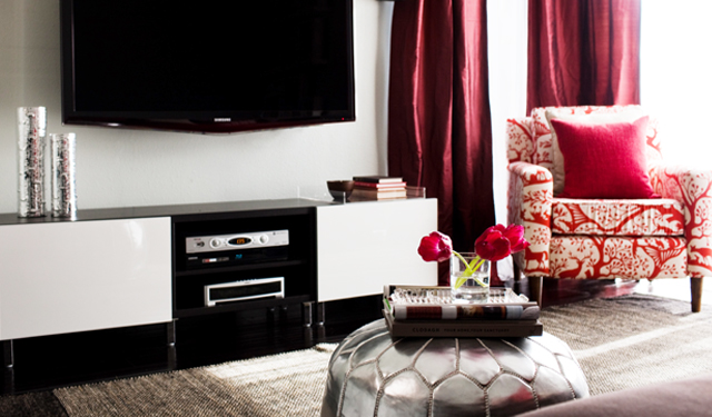
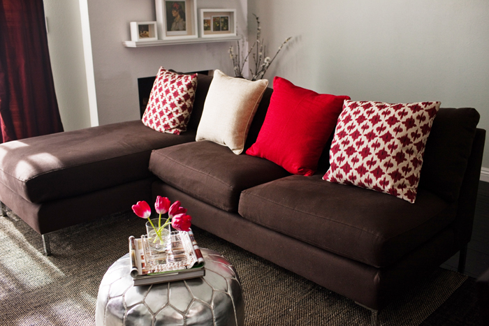
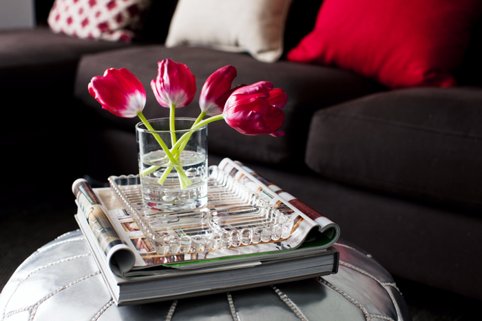
I originally got the acrylic tray from CB2 for the pouf, but it was a bit too big. It worked out, because I like it better on the media cabinet. In it, I put brown and red vintage books.


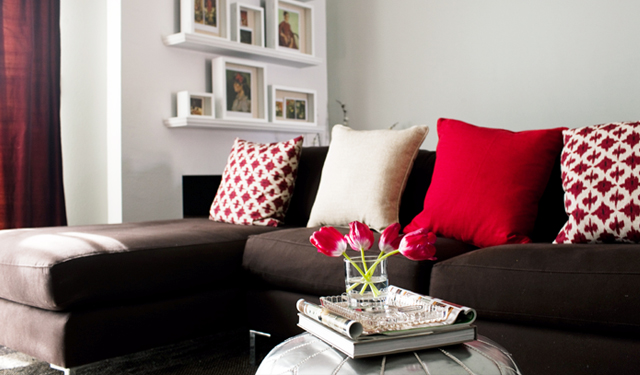
The shadow box wall is my favorite part!
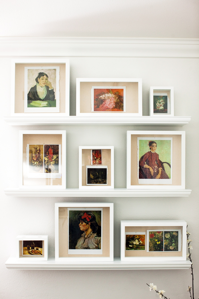
Art books are the best sources for inexpensive art. These prints came from a large Van Gogh art book that was $20 at Borders. Van Gogh's portraits are so intriguing and were perfect for this space.

I helped my customers choose the wood and granite for their new kitchen.
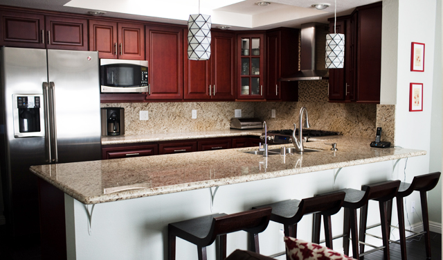

And the stools are from homedecorators.com.
That's it! I hope you enjoyed it :)



That is amazing!!!! WOW!!! You are extremely talented!!!
ReplyDeleteReally beatuiful! I would never think to pair crimson & red together, but I like it! And, I LOVE the shadowboxes...just did a post on them for kids rooms. Fantastic all around!
ReplyDeleteBeautiful, Bryn! I agree the shadow box wall is my favorite. Can't wait to see more of your work!
ReplyDeleteWonderful job! Your client must be thrilled! It really does not even look remotely like the "before!"
ReplyDeleteLove the after/~
pve
Dang girl! To say you have found your calling is an understatement! You are wildly talented... can't wait to see more!
ReplyDeleteYou did a great job! I love the shadow box wall and the different reds that I wouldn't have thought to use together but look amazing!
ReplyDeletebeea-uu-ti-ful!!
ReplyDeleteLove it!
Congrats Bryn, this is such an accomplishment! The room is gorgeous. Can't wait to see more "after" shots!
ReplyDeleteFabulous transformation! Janell
ReplyDeletevery lovely!
ReplyDeleteLooks beautiful! Fantastic work!
ReplyDeleteLooks great - where are those shadow boxes from?
ReplyDeleteFABULOUS!!
ReplyDeletejust wanted to say that the colour combo. is gorgeous and refreshing amidst the popular pastel :)
ReplyDeleteYou did such a great job! Congratulations :)
ReplyDeleteI love how the red pops against the neutral colors and that chair fabric is awesome!
Great job! I'm loving the red!!! I like how the red is found in the Van Gogh art
ReplyDeleteThis space is so great Bryn - thanks for sharing it with all of us! I love the red curtains. Your photographer did a great job also!
ReplyDeleteEnquiring minds want to know: What did you decide for the drop cloth curtains in your living room? Did you decide to dye them kelly green or leave them natural and trim them out?
- Danielle
Love the room! Huge transformation. Where did you get the shadow boxes from? I love them and have been looking for some just like that. Thanks!
ReplyDeleteGreat work - it's difficult to have a 'vision' and see it come to fruition.
ReplyDeleteThe shadow boxes are from Aaron Brothers. Luckily I picked them up during their penny sale, otherwise they are a tad pricey.
ReplyDeleteFantastic room!! Can't wait to see more of your work.
ReplyDeleteFabulous! You did a great job. It doesn't even look like the same space.
ReplyDeleteTwo questions -- where did you find the white shelves (holding the shadow boxes) and the drum pendant?
Bryn, this is fantastic! Absolutely beautiful; were I the client, I would be thrilled with the outcome.
ReplyDeleteLooks great. Love those pillows!
ReplyDeleteGorgeous gorgeous gorgeous!!! I love it! Thank you so much for sharing!
ReplyDeleteGood job. Love the idea of using art books.
ReplyDeleteBryn! Your work just keep getting better and better! Great job girl!
ReplyDeleteI love it! I think the best part is the colors- I never would have put the two different reds and the blue grey together. Genius!
ReplyDeleteGreat job! I LOVE those barstools.
ReplyDelete~ Joanna
Looks great--did you have professional photos taken?
ReplyDeleteWow, this looks beautiful! Love the red...it's such a hard color to work with but you did great! My den is read and I am saving the post for inspiration!
ReplyDeleteYay, its so exciting to see another of your spaces!!! It's beautiful!!! I remember when you were posting about the red drapes...they really do look great. So nice to see it all come together. I love the pillows with the ikat fabric and the shadow box wall:)
ReplyDeleteenjoyed.
ReplyDeleteWOWWWWWW! You did an amazing job!!!!!!! It doesnt' even look like the same house! Wonderful work...can't wait to see more!
ReplyDeletehi! the room looks great. i have the same ikat-type fabric & will eventually reupholster my sofa in a brown fabric i have on hand. love how you made all of the diff colors really go together. would you mind telling me the paint color from martha? thanks!
ReplyDeletegreat job! its beautifully done!
ReplyDeleteWhat a transformation!! This room belongs in a magazine!
ReplyDeleteIt looks great! Congrats Bryn :)
ReplyDeletewww.bazaarofserendipity.blogspot.com
Beautiful! Where did you get the white shelves that hold the shadow boxes?
ReplyDeleteAmazing work! I love love the bar stools in the kitchen! I'm not finding them on the homedecorators website. Could you post a link to them? Thanks
ReplyDeleteFantastic job, Bryn! I looooooove the fabric you chose for the curtains.
ReplyDeleteWow! You really did a fantastic job on this room! I love the use of color and pattern ~ that IKAT fabric is fabulous!
ReplyDeleteP.S. Did you take these photos? If so, what kind of camera/lense did you use?
ReplyDeleteWonderful job Bryn!!!! Cant wait to see more :)
ReplyDeleteBryn, it looks fantastic! I love the red, and the shadow box wall turned out amazing. Perfect solution for the fireplace!
ReplyDeleteI love it! where are the branches from? i am looking for something just like it. thanks :)
ReplyDeleteBeautiful! I love that we're starting to see rooms you've designed yourself!
ReplyDeleteThis is amazing! The before is so drab and the after just pops! And I like the idea of using art books for prints!
ReplyDeleteLooks so pretty! What an amazing after - great work. Again wow, I alwasy love afters, we just finished our dining room, its so much fun to enjoy a new sapce
ReplyDeleteBryn! Seriously lovely how you made that room transform. What vision you have.
ReplyDeletejbhat
I love the room! You did a fabulous job! Where did you find the white shelves? They are exactly what I've been looking for for my nursery. Great work!!
ReplyDeleteWhat a transformation! I love the fireplace. I wish that it was more of a focal point in the room. I also like the pops of red- it adds some drama to the space! The only thing that I'm not a huge fan of is the silver footstool. It's just too small for the space and the decor balanced on top looks too big for the scale of the piece.
ReplyDeletelove it love it love it!And I am not a red color person!LOL
ReplyDeleteWonderful job refreshing and breathing light and fun into the space!
ReplyDeleteWow! Absolutely beautiful! I love the room! And now that you are in NC...the hubs and I will definitely keep you in mind when we get to build our barbie dream home...hopefully you will still be in NC by then! =)
ReplyDeleteGreat work Bryn! I am so excited to start seeing your spaces and all the hard work you have been doing. Can't wait to see the website too!
ReplyDeleteGORGEOUS! NO doubt about it, you obviously have a gift for design, B!
ReplyDeleteWonderful job! I can't wait to see more of what you have done/will do.
ReplyDeletethis is gorgeous - you can't even tell it's the same room!
ReplyDeletetalk about great..by far ...love it.
ReplyDeleteYou did an AMAZING job with that room. I must say, I'm in love with that shadowbox wall. I want to do something similar. I have a book of Los Angeles photos that I'd love to rip out. Is there a "best" way to do the ripping?
ReplyDeleteGORGEOUS - your so amazing - I am so happy we are friends!
ReplyDeletewhat a fun space! thank you for sharing---i love so many of the elements. you did an amazing job. i love the shadow box wall too---and i especially love that you left the edges "raw" on the book pages. is that a weord thing to notice and like? hey, it's not like they are real, right... i love that you intentionally left the edges that way.
ReplyDelete*can't wait to see more spaces.
:)
HEART the drum light... can you share details on where to find?
ReplyDeletethanks.!
Another beautiful makeover! Love the monochromatic palette and mix of textures!
ReplyDeleteI am new to your blog (found you via Design*Sponge), and WOW!! There goes the rest of my morning, I know I'm going to spend it browsing through all of your wonderful interiors!!
ReplyDeleteFirst off...what a transformation!! That room looks amazing! Now onto my random question...can you tell me where you got the branches you put in the corner by the fireplace?? I have been toying with a setup a lot like that for my mantel, so I would love to know where you got them. Thanks so much and keep up the fabulous work!!
ReplyDelete