First, I'd like to send a million thanks to my amazing photographer Michael Norwood. He captured Matt and I at our wedding and was able to capture my spaces with the same amazing eye. If you are in the Southern California area, I highly highly highly recommend him.
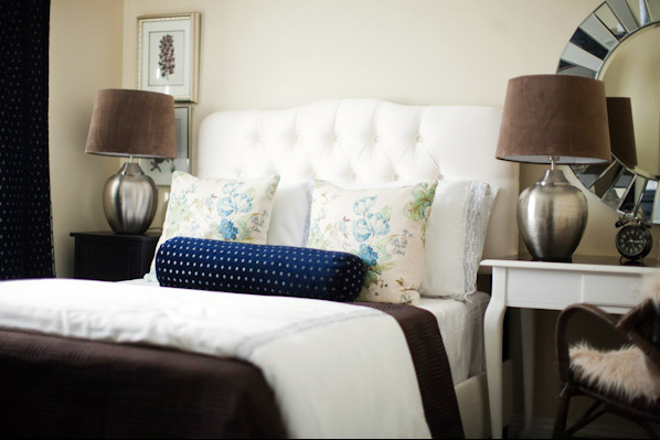
Okay first up, the guest room. I knew I wanted to create a neutral, elegant room. I started with the desk I found on Craigslist and refinished. Then I chose a gorgeous navy blue chenille fabric to use for the curtains and a bolster. The room just took off after that, knowing my color scheme would be ivory + brown + navy.

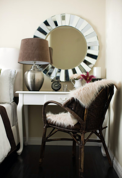
The mirror is from Home Goods, the chair and rug (placed on the chair) are from Pier 1.
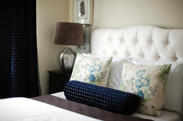
The tufted ivory bed is from JCP!
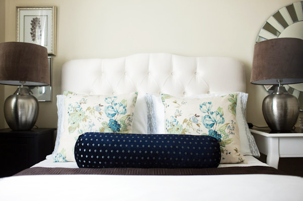
The floral pillows are my favorite part. The fabric, along with the curtain and bolster fabric, is from Home Fabrics and were around $5.99/yard for the pillows and $7.99/yard for the navy chenille. I'm going to miss that fabric store so much!!! The pillows were the first pillows I ever sewed myself (with a zipper).
The floral art behind the lamp is from my favorite (free) art site, Vintage Printable.
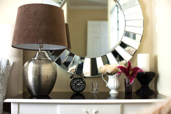
I'm so happy to share my projects with you, please stick around there will be more where this came from!




Absolutely stunning. We need your help here!
ReplyDeleteBeautiful! Love the mirror and navy fabric the most!
ReplyDeleteLOVE! I love that it's not a huge space but you still included great pieces and accents. A room doesn't have to be huge to be very chic!
ReplyDeleteLovely!
ReplyDeleteLooks dynamite! Love the fur on the chair. And how brave of you to sew your first zipper pillows for a client! Way to go!
ReplyDeletelooks fantastic!!! really nicely done!
ReplyDeleteIt looks amazing! I absolutely love it!
ReplyDeleteGreat job! I love the color palette!
ReplyDeleteSTOP! This room looks AMAZING!!! You did an awesome job!
ReplyDeleteBeautiful, Bryn! So proud of you. :)
ReplyDeleteAbsolutely Gorgeous!
ReplyDelete...and my mom has an old oak desk in her basement just like the one you used...wonder if I can steal it to refinish...she may never know!
it's gorgeous. can't wait to see more of your projects.
ReplyDeleteReally-REALLY nice! I love the taupe lamp shades in velour is it? Everything really flows together beautifully. Love it.
ReplyDeleteBEAUTIFUL!!!!!! Its stunning!!!
ReplyDeleteCongrats Bryn! Everything looks great!
ReplyDeleteI am VERY impressed!
ReplyDeleteyou really are incredibly talented- this room is perfect.
ReplyDeleteYay, Bryn!!! We've been waiting so long for this and you didn't disappoint! Congratulations, the room is beautiful! Love all the reflecting light and the mix of textures.
ReplyDeleteBeautiful work; very classic.
ReplyDeleteLove it! Where did you get the lamps and the clock?
ReplyDeleteIt looks amazing! Wow, so elegant and gorgeous! Great job.
ReplyDeleteGReat job - you must be thrilled to finally have pics!
ReplyDeleteYou did a great job! It looks amazing and perfect for a guest as calm and classy.
ReplyDeleteI love your style, Bryn. Classic and elegant. :)
ReplyDeletelooks great! the floral fabric is the perfect touch!
ReplyDeleteLove it! everything looks perfect!
ReplyDeleteAbsolutely GORGEOUS!
ReplyDeleteGorgeous Bryn! Great Job!
ReplyDeleteCongratulations, if this is a sign of things to come you have a wonderful career ahead of you! Janell
ReplyDeleteCongratulations!! Fantastic!
ReplyDeletethis looks great, congrats!
ReplyDeleteGreat Room. What is the carpet? Once you get settled in CLT, you'll have to make a trip to Mary Jo's in Gastonia (about 20 mins south on 85). I've heard people refer to it as the fabric mecca. Good luck getting settled. Love the blog.
ReplyDeletewhat about those stately lamps..? I assume the shades were covered with fabric? please tell..! the effect is so glamorous. love your styling.
ReplyDeleteTo answer the questions about the lamps - both the lamp bases and the shades are from Ikea!
ReplyDeleteSo pretty, Bryn! Love it! GREAT job!!
ReplyDeletexoxo, jenny
may I know how much that bolstered headboard cost? and did u buy it at JCP online or at the store? Thanks! beautiful room!
ReplyDeleteWOW- this room is just amazing!!! What lucky clients you have, the room is stunning. Please show more, this was just like a teaser!
ReplyDeleteIt looks sooo high end. Great finds, great presentation. You really have an eye!
ReplyDeletejbhat
OMG Bryn I am having a major panic attack over your insane awesomeness right now!! It is absolutley a gorgeous room - you should be so proud!!
ReplyDeleteWonderful job Bryn! Congrats and good luck - your going to do so well!
ReplyDeleteThe room looks so great! How exciting! Look forward to seeing more.
ReplyDeleteOverall you did a good job but there are a few things that bother me with the room.
ReplyDeleteI do find it laughable that you charges $75 an hr for interior design consults.
this is so beautiful! thanks for posting. can't wait to see more! :)
ReplyDeleteTo Shawna - I do welcome constructive criticism, so please share what bothers you about the room. As for the $75 - that is for a one hour in home consultation which is more involved i.e. moving furniture, styling, etc.
ReplyDeleteMy normal rate is $50/hour but I usually do flat rates for clients which typically ends up equaling much less than $50/hour. I feel I have pretty competitive rates for a self-taught interior decorator.
Also please note this was my very first in-home project working with a client, I do believe I will grow as an interior decorator as time goes on. And in turn, the clients got my services for less than minimum wage.
I hope you find my other spaces more pleasing, I will continue to share them.
Love it! Where are the lamps from? Did I miss it?
ReplyDeleteGorgeous! Thanks for sharing.
ReplyDeleteCongratulations! It looks great -- I love the mirror!
ReplyDeleteHi Bryn,
ReplyDeleteThe 2 things I found a bit off in the room in my opinion were the size of the lamp...specifically the base and the way the lamp on the left blocks the frame at the bottom. Other than that I think you did a great job and look forward to seeing more of you work.
Oh! This room just makes me swoon! I love just about everything about it! I love your blog and have never commented before, but I had to come out of the woodwork for this one!
ReplyDeleteI ADORE the color scheme, and can't believe that headboard is from JCP! So chic.
Are you considering doing the ever-growing-in-popularity on-line consultations and mood boards?
The pillow are so pretty. Thanks for sharing that art site, I will have to check it out. You can't please everyone and you can't work for free. I think the room is pretty, not my taste, but I am sure your client was very happy and that is all that matters.
ReplyDeleteawesome!! i love the desk. very chic!
ReplyDeleteI love... the mismatched desk/ side table, giant mirror, blue fabric... As cheap as I can be, I think $75 for an hour consult is a steal for someone with your talent!
ReplyDeleteSo beautiful, congratulations!
ReplyDeleteshawna - shut it.
ReplyDeletebryn - dude. you're the next big thing. i'm so proud of you.
I love it, Bryn! Look forward to meeting you in person!
ReplyDeleteBoo to anyone who wants to be negative ... It looks fantastic, and you did it on a budget!
Well done! The room turned out so great!
ReplyDeletethe palette is very pretty.
ReplyDeleteCongrats! Gorgeous room! I love everything about it!
ReplyDeletefresh and lovely, and hard to beleive it was done on a budget!
ReplyDeleteLove the room, it is so gorgeous!! Especially the mirror and the pillows!! Congratulations! I can't wait to see more of your work.
ReplyDeleteOMG it looks soooo good! im so happy for you! skys the limit! :)
ReplyDeleteGorgeous! Congratulations!
ReplyDeleteThat is wonderful! We could use your help in our bedroom!
ReplyDeleteIf this is your first project, I can't wait to see whats in store!! good luck girl.
for everybody asking... I'm pretty sure the lamps are the ikea asele table lamps... $59.99 but i would not recommend as mine lasted about a year and then quit working. cute room bryn. : )
ReplyDeleteIt looks effortless and the photography is great. Thanks for sharing! : )
ReplyDeleteabsolutely gorgeous Bryn! I love hearing how you create a look like for so much less than you'd think!
ReplyDeleteOooh, what a pretty, sophisticated bedroom! Can't wait to see more!
ReplyDeleteIt's so beautiful Bryn!
ReplyDeleteAbsolutely love it!
ReplyDeleteQuestion:
How did you print the botanical's? Did you just do it at home?
And where did you get those great frames??
Thanks in advance!
The room looks great. BTW, Michael Norwood is an amazing photographer. My sister used him for her wedding a few years back and we also had him take our family portraits last fall. He is awesome and I highly recommend.
ReplyDelete~Jessica
Awesome job! love your style and I think you're on to big things with this career!
ReplyDeleteBryn, since you asked for constructive criticism.
ReplyDeleteThe room is nice and it has all the right "notes" of decorating right now (tufted headboard, interesting looking mirror, sheepskin on a wicker/rattan chair, layers of pillows on the bed, using light and dark fabrics for visual interest, etc.) but somehow they look a bit off when put all together.
I think it is because is appears that the scale is off on several of the accessories (mirror, prints and lamps, while nice, are not quite the right size for the space). I also don't get the dainty floral of the pillows with the dark drapes and bolster and dark browns. The color blue in the pattern is gorgeous but it just doesn't work for me. I think to my eye it is because the botanical prints that could help mirror the them are almost entirely blocked by the lamp.
Looking forward to seeing your other projects.
Overall, I really like the room. I think your color palette is very warm yet calm and seren and the use of textures is fantastic. Individually, all of the pieces in the room are wonderful - I especially like the mirror and headboard.
ReplyDeleteThe things that don't quite work to my eye are the position of the lamps and two too many decorative items on the desk.
With the lamps, on the right it seems to overwhelm the table surface and sits too close to the wall while covering up the art. On the left, again it's a scale thing where the lamp feels like it's looming over the bed and it hides all of the other items on the table; I think just moving it to the other side of the surface would be a better balance.
On the desk, it's just too many little things - I would remove the lily+vase and the glass (?) thing in the middle.
Still, you did a great job with your first project. Congrats!
It looks amazing and the tufted headboard, non-traditional color scheme, & your desk refinish job are gorgeous- good choices. Maybe it would be better if the prints above the left nightstand were hung slightly to one side so they wouldn't be so obscured? All together, you did a beautiful job and I can't wait to see more of your work!
ReplyDeleteI love, love, love this. My only question is why are the floral prints hung so low? I'm not even close to being a designer so I'm just wondering if this is a style thing or a balance thing...or it just looked cool to you?
ReplyDeleteAlso, like I said: not a designer of any sort, but to my untrained eye the juxtaposition of the light and heavy fabrics is really neat and really pleasing.
Thanks for sharing, can't wait to see more!
to the comments re: the artwork & the lamp. It was totally intentional to almost completely cover the second piece of art, maybe I'm a bit weird like that :) But I loved the layering look of it. I like that it's layering unconventional items, just like you would layer bedding or books. It adds a bit of interest, too, because it makes you wonder what's behind there? But I definitely understand it's not for everyone.
ReplyDeleteThank you all for the great comments and feedback! I really really appreciate it :)
One more note about the art and lamp, sort of like an analogy. Imagine the piece of art is like one of your favorite graphic t-shirts.. even though it has a graphic on it, you could still put a cardigan and a coat over it and look great with a little bit of graphic peaking out. I sort of went with that approach.
ReplyDeleteI love this so dang much! Beautiful, modern and classic all in one. Great work!
ReplyDeleteBryn - I love how the room turned out! I really love the navy blue mixed with the light blue in the floral pillow - congrats!
ReplyDeleteFabulous, Fabulous job!
ReplyDeletevery late to the party bryn but I AM IN LOVE!!!! SO beautiful!!! you've got amazing style and those pillows are the best!!
ReplyDeletexoxo,
lauren
Bryn, it is soooo gorgeous! Fabulous job, m'dear!!
ReplyDeleteWOW! I'm late, but I love what you've done here! GOrgeous!
ReplyDeleteCongratulations!! Fantastic!
ReplyDeleteGorgeous Bryn! Great Job!
ReplyDeletelooks great! the floral fabric is the perfect touch!
ReplyDeleteGReat job - you must be thrilled to finally have pics!
ReplyDeleteI am VERY impressed!
ReplyDeleteBEAUTIFUL!!!!!! Its stunning!!!
ReplyDeleteGreat job! I love the color palette!
ReplyDeletelooks fantastic!!! really nicely done!
ReplyDeleteLOVE! I love that it's not a huge space but you still included great pieces and accents. A room doesn't have to be huge to be very chic!
ReplyDeleteAbsolutely stunning. We need your help here!
ReplyDeleteI just joined your blog.... Love it! I was wondering if you remember the paint color you used for the guest room reveal? I am looking for a great neutral color. Thanks.
ReplyDeleteLove it!!!
ReplyDelete