One big task was installing our new dining room chandelier. Within a matter of 15 minutes, my dad had it up and running. Thanks Dad!!!!
And here it is...
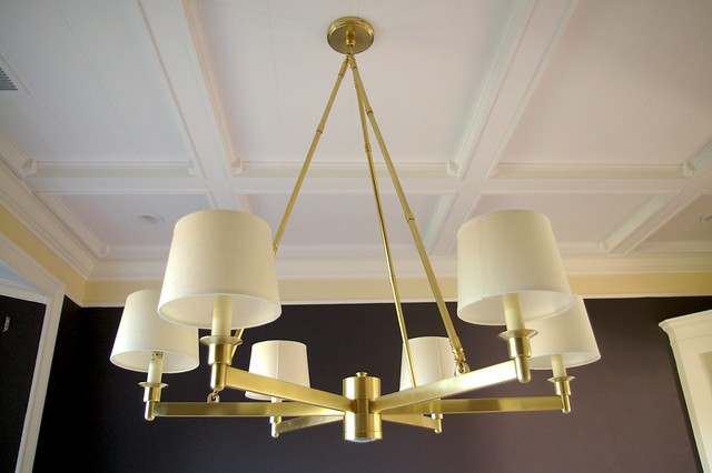
The chandelier is to the trade and can be ordered through me (email for info).
The dining room has also been 95% painted. This room is really hard to photograph because of the large bay window, so I will have to show it to you in sections.

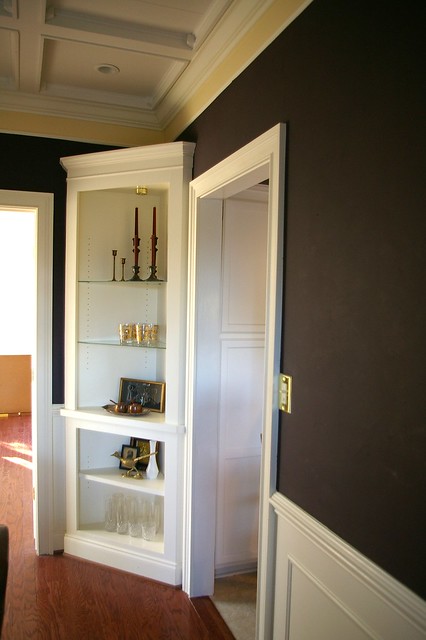
The thin strip right below the ceiling is the section that has yet to be painted. I am trying to decide if I want to paint it white (like the ceiling) or purple (like the walls). I'm leaning towards white to give the illusion of a very thick molding.
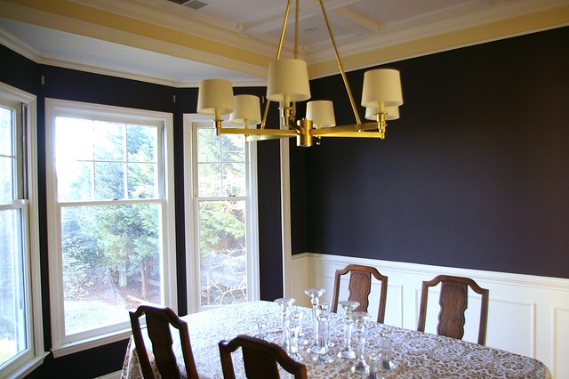
I really LOVE this color. It's Kalamata Olive by Martha Stewart (Home Depot). Depending on the lighting and time of day, it can look anywhere from eggplant to deep dark brown to black. But it NEVER looks Barney purple, which is what I didn't want ;)
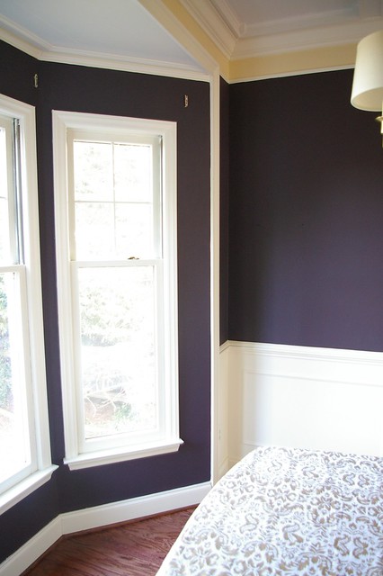
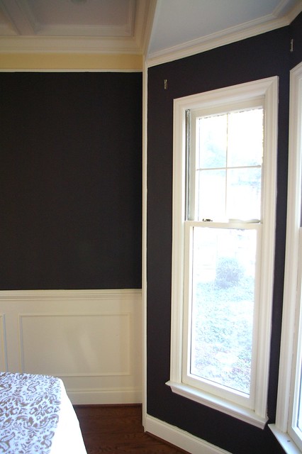
I'm not a fan of corner built ins and I'm not sure exactly what I'll do with these yet. Maybe wallpaper? Or paint the backs purple? For now they hold all of our vintage barware.

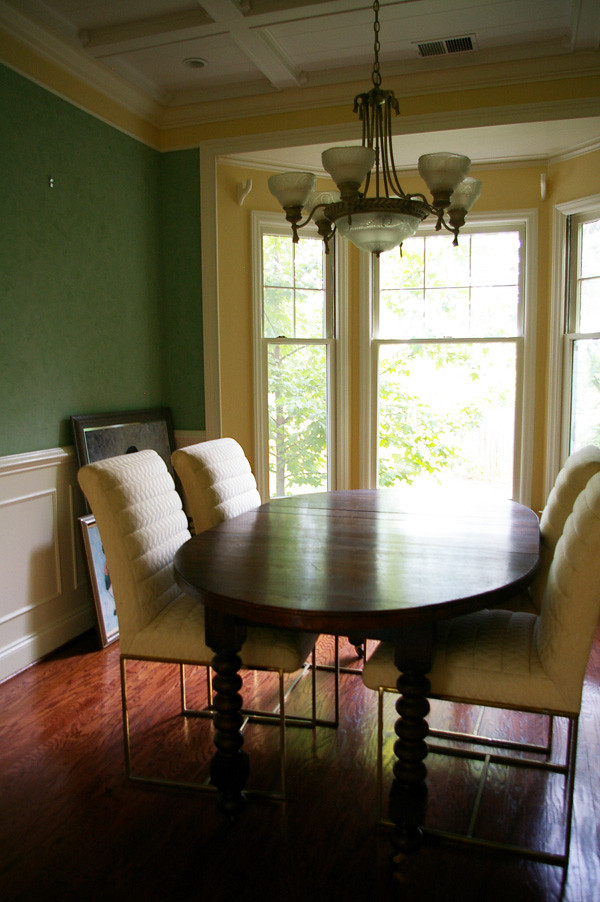
If you remember, this is what it used to be:
And this was my board for it:
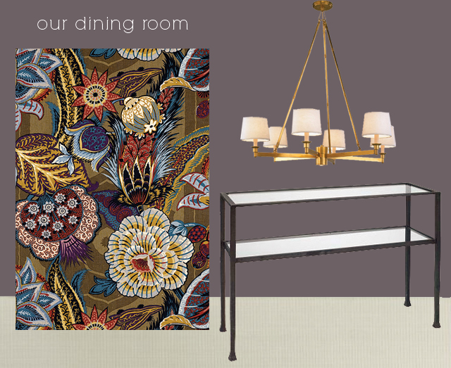
If you are curious about the old antique table that used to be in this room, it got moved to the kitchen and I LOVE it there. I will share pictures soon. And the brass upholstered chairs are just waiting for a good upholstery job :) It's all a work in progress as I'm sure you've learned by now.
On an unrelated note... I will be posting the January giveaway later today. Unfortunately I only have ONE item this month but it's a pretty cool one. Check back soon!


Wow. I LOVE the purple color. I thought it was black or a dark blue at first. Love love love it.
ReplyDeleteWow, it looks so much better already! The purple is perfect. And your bay windows are so beautiful!
ReplyDeleteWow, it looks so much better already! The purple is perfect. And your bay windows are so beautiful!
ReplyDeleteThe paint color is gorgeous, but due to the built-in cabinets I'd say that trim strip has to be white. It will make the cabinets less obvious against the ceiling if that makes sense. Wallpaper or fabric would rock those cabinets. I love storage, but yeah, built ins are often a necessary evil. Looks great with the barware though!
ReplyDeleteI think the wall color is turning out great! And if it were me, I would paint the yellow strip white. I can't wait to see the finished room!
ReplyDeleteLOVE it!! Looks great!! I know what you mean about the corner cabinets - they can be so awkward. Could you have custom doors made? That way they don't have to display anything. Pricey option, I know, but just an idea! Love seeing all of the updates. Just saved the name of the paint in my files!
ReplyDeleteLove the chandelier! Everything is coming together. I really like the idea of painted the strip white to give yourself a beefier molding too. Very nice.
ReplyDeleteI really like the idea of going white up in that space between moldings, the new lighting makes a world of difference too! It is coming together very nicely.
ReplyDeletelooks gorgeous. love the idea of painting the strip white and wallpapering the insides of the built-ins. didn't realize all the gorgeous wood work either. love it!
ReplyDeleteLove the colour. And I agree you should go with the white to make it look like bigger molding. Nice!
ReplyDeleteLove the chandelier and the wall color! I definitely thought it was a dark brown at first. Gorgeous!
ReplyDeleteI think you should paint that stripe white, too. It'd definitely give the illusion of thicker molding.
x
Wow Bryn. LOVE IT ALL. So chic.
ReplyDeleteBeautiful updates, Bryn! I'd paint the strip white to make the molding look larger. Wallpaper in the corner shelf would be perfect! Can't wait to see what you do with it.
ReplyDeleteIt looks fantastic Bryn! That chandelier is perfect.
ReplyDeleteAs for the small strip at the top- I really like the idea of going white to give the illusion of large crown molding.
That chandelier is definitely drool-worthy. Your dining room looks amazing! -I esp enjoy the bold, dark paint you chose.
ReplyDeleteStunning! I vote for wallpaper in the built in! Love the light fixture against that wall color.
ReplyDeleteI'd never think to paint a room a very dark color, let alone dark purple! I absolutely adore this room! Great job!
ReplyDeleteI mean the color! Cannot type!
ReplyDeleteThat turned out so amazing! It's like a breath of fresh air while still maintaining the very traditional, classic look. The chairs are my favorite, too!
ReplyDeleteLove the deep purple. Can't wait to see the finished room!
ReplyDeletepaint the yellow white.
ReplyDeletenice job - it's looking fantastic. great choice in light fixture!
Is the fabric in your board being used for the chairs or window treatments? It's beautiful. I can't wait to see the finished room.
ReplyDeletetesting
ReplyDeleteThe chandelier is beautiful! If you decide to keep the bookcases, then glass doors might be nice. They would show off your nice vintage barware. Can't wait to see how the room turns out! Love our blog!
ReplyDeleteTesting
ReplyDeleteI'm loving seeing it come to life!! With the corner built-ins, what if you used the gorgeous fabric you're using elsewhere in the space as wallpaper? That could be really stunning. And I think the illusion of thick crown molding is a great idea.
ReplyDeleteSo bold, I love it! You should paint the last strip white! Thick moldings would fit right in with the gorgeous woodwork on your ceiling!
ReplyDeleteIs that a built-in cabinet? So functional for a dining room. Really wish I had an extra spot to store and display some dishes and other pieces.
ReplyDeleteLOVE the colors and the chandelier fits the style in perfectly!
Yup! It's a built in cabinet. The previous owners added all the molding and built ins which was a big selling point. I like having built ins, but for some reason built-ins in corners aren't my favorite.
ReplyDeleteHey, you figured out comment replies! Hooray for you!
ReplyDeleteIt looks simply GORGEOUS. I am in love with the color and the chandelier is stunning too.
jbhat
I adore that chandelier. Love, love, love!
ReplyDeleteLove the wall color! It looks great!
ReplyDeleteThat color is so rich and beautiful! I think wallpaper would look pretty cool in those corner shelves.
ReplyDeleteWall paper top portion and add doors to the bottom portion would be my suggestion. I agree with painting the strip white to create the illusion of thick molding.
ReplyDeleteThat is a really beautiful room and full of so much character. The table you moved to your kitchen is more than perfect. I love that piece. I think that white painted where the yellow is would look really nice and would look like extended molding. We have that same type of "molding" at the top of our dining room and i like how it looks.
ReplyDeleteI don't know how I missed this post... but I did. I looked at it after someone on today's post said something about your 'purple' dining room. I think that it is dark enough that it reads as a neutral. Like you said- it's not Barney purple.
ReplyDeleteAnd I think you should do a fun wallpaper on the back of the corner cabinet!
I love the paint colour. It's gorgeous. Would love to see the Martha Stewart range here in Australia, but I can only dream.
ReplyDeleteI agree with everyone about painting the trim white. I don't mind your built-ins at all. I'd like to see them wallpapered, but in a plain rather than a pattern.
You've done an amazing job.
Sandy K
Love it! And that wallpaper is divine! Who makes it? It would look so great with the wall color...
ReplyDeleteummmm can I have those dining room chairs with the metal base? to.die.for!
ReplyDeleteI am interested in getting information about the chandelier in your dining room. Depending on the size, I think it would be a perfect style for our dining room.
ReplyDeleteThanks,
Teresa
bryn, you so badly make me want to buy a fixer upper! dining room is gaw-jus :) definitely wallpaper the corner shelf!
ReplyDeletetesting part two
ReplyDelete