Wednesday, June 30, 2010

hump day truth

Love this, found via decorista.


And while I'm at it, I also love love LOVE this:


Found via Haven & Home. (It has a very important underlying message: there is no right or wrong way to love and be loved.)

Decor To Go

I have a handful of great local clients which I have been having lots of fun with (grasscloth wallpaper! lucite coffee table!), but another aspect of my business is one I haven't shared with you yet. It's called Decor To Go. It's a mix between full service design and design boards. I come up with the entire plan, including fabrics, paint, etc and then mail it to you!

Here are some pictures of one I recently finished:


[Decor To Go also comes with source lists and a full written plan, not pictured]

Growing up, projects were my favorite part of school. It didn't matter what class - English, Science, History - if there was a project, I got an A (tests were a whole other story.. eek). Decor To Go brings out the inner school girl in me and I really really enjoy doing them. Maybe it's because I also loooooove fabric.

To learn more about my Decor To Go, click here.

Tuesday, June 29, 2010

Making a First Impression

The front of your house is very much your home's first impression. I've never been good with first impressions (I'm shy and awkward), but I think I can help our home make a good one.

Here is our entrance right now:


Not bad, could be better.

A quick, inexpensive fix I'm going to do is paint the white storm door black.

Although I like the scale of the sconces, I'm not a fan of the brass and the shape. Instead, I like the simple shape and black color of these:


The house numbers (which I blurred for privacy reasons) are also very traditional. I'd like to throw in a bit of a modern touch with these house numbers:


I once saw an inspiration picture of a very traditional home with Century Gothic-like numbers and it created the perfect juxtaposition. If someone has that picture or knows where I can find it, I will be so grateful.

I really would love two tall black planters, just like Holly's:


I haven't seen any that I love as much as hers though (love that trellis design on them!).

A simple natural doormat is my preference:


Eventually I'd also like to replace our mailbox which is rusty and yucky. And landscaping- but that will come with time and sweat.

Those are my simple (and for the most part budget friendly) plans to transform our entrance to better reflect the inside of our home. Now it's just a matter of doing it! :)

ps- did you see Design*Sponge's post about entrances yesterday? It was great! Here are some of my favorites:


(I actually considered painting my door this type of yellow. "Egg Yolk" by Martha Stewart to be specific. But I just don't think it's in the style of our home. It's gorgeous here though!)


Monday, June 28, 2010

Design Board - Inspired by Chiang Mai Dragon

I had a great time with this entry way design board. First, the space is one of those amazing New York City entries with the old door and mouldings that you see in movies and in magazines.


Second, the client said she wants wallpaper - which is music to my ears. And third, her adjoining living room has Chiang Mai Dragon, and she asked to incorporate that somehow.


And fourth, she had a pair of hunter boots. And I love hunter boots.

Here is what I came up with...


As a courtesy to my e-Decorating clients, I do not post sources on my blog. If you would like information on something featured in the design board, please email me at bryn@brynalexandra.com. If you would like more information about e-Decorating and design boards, please click here. Thank you for understanding.

Friday, June 25, 2010

Tile!

Matt and I recently met our neighbors across the street and I learned that the husband does wonderful tile work!

Oh, the possibilities...


(some of these may be repeats, because I love them so much. Also if you know the sources please let me know and I will credit!)

Thursday, June 24, 2010

Things that make me stop in my tracks.

Usually I'm go go go on the internet finding things for clients and design boards and sometimes the house. But every once and a while I'll see things that make me stop in my tracks, and I file it them away. Here are some of those things...


Tom's New Wedges


Also, I was able to find a new bathing suit that isn't your typical string-tied, triangle top, way-too-skimpy variety. Although I would have liked a J.Crew suit, I found this suit at Tar-jay for a much more wallet friendly price ($18 a piece):


Surprisingly, it's very similar to one of the suits I wanted at J.Crew:


For all my pale friends out there, buy a white suit - it will make you feel tan!

Wednesday, June 23, 2010

Scenes of Summer

It's hot. Really hot. And here's how we beat the heat:

Linoleum floors (Char likes them much more than I do):


and cut offs and fans:


And Coke Zero (not pictured).

EDIT - yes that's my printer on my kitchen counter! A little update on the ink spill for those of you who follow the blog. My printer didn't die, thank god!!! I took it out to the backyard and cleaned it inside and out, then placed it on our kitchen counter with a trash bag and drop cloth underneath for monitoring. So far, so good, no more ink leaking. Once the office gets together, it will move upstairs to it's permanent home. Also - the ink leaked because I got cheapo knock off cartridges thinking I'd be saving money.

Dining Room Design Board

I really like designing dining rooms. I think it's because I can imagine the clients making some great memories in them. :)


As a courtesy to my e-Decorating clients, I do not post sources on my blog. If you would like information on something featured in the design board, please email me at bryn@brynalexandra.com. If you would like more information about e-Decorating and design boards, please click here. Thank you for understanding.

Mmm.... Expensive Fabric

Who doesn't love expensive fabric? Even when on a budget, just a yard or two can make all the difference in a room. Here are some of my favorites -


And I saved the best for last:


1, 2, 3, 4, 5 are Schumacher. 6 is Villa Nova for Romo.

Tuesday, June 22, 2010

It sure is green here in North Carolina.

And I love it.

This is the view I am blessed to see every night while sitting in our living room:


And my favorite part - where the evening light shines through the trees.


The colors remind me so much of this room from Domino I've been pining over for years.


Life is beautiful, friends!

I looooooove white.

It's been a couple weeks (a month?) since we painted our family room white. It's hands down my favorite room in our home and I'm so so glad we did white! White is my favorite "color" right now.

Sooo you know when I stumbled upon this space by Brad Ford ID I was in love!


[pictures from Brad Ford ID]

This space reminds me of one of my favorite artists - ericka o'rouke. I am a huge fan of her pottery:


Monday, June 21, 2010

What's going on here at our first place

If there was a line graph of progress here at our first place, it'd look something like this:


[graph found via google images]

And the drop off point would be when our family left us.

Priorities have shifted to getting my office done. When I find free time, I put a coat on my office desk. It's a vintage mid century modern piece that came to me really beat up, so I did some patching and sanding and a couple coats of paint.


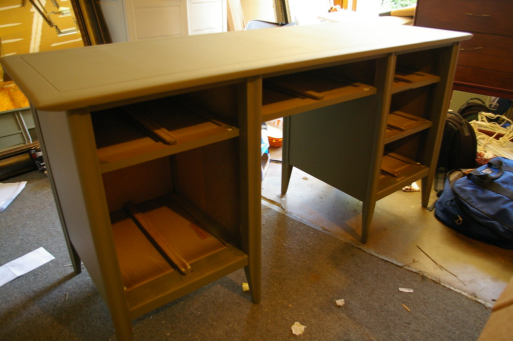
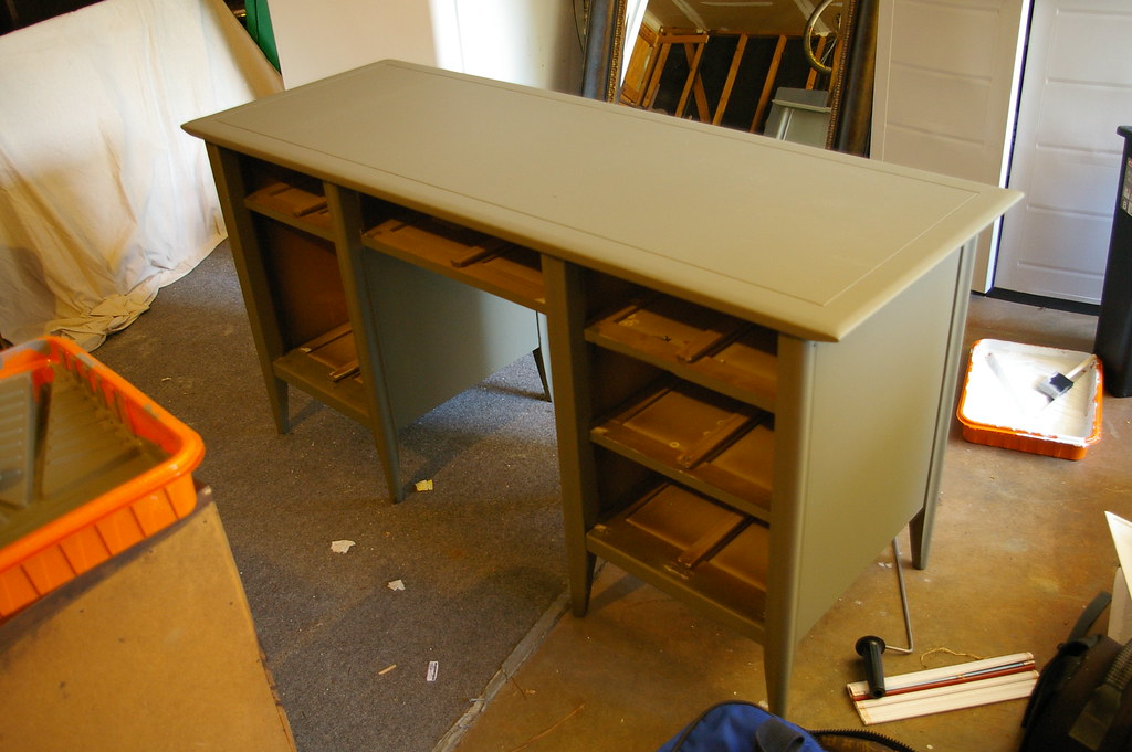
The color is Martha Stewart Falcon (mixed in BEHR premium plus ultra). It's the perfect Army Green with a bit of milkiness to it.


Originally I wanted a super gloss finish, but I've been liking the smoothness of the flat paint. So I will use Satin poly instead of Gloss to protect it. I still have at least two more coats of paint and a couple coats of poly to go.

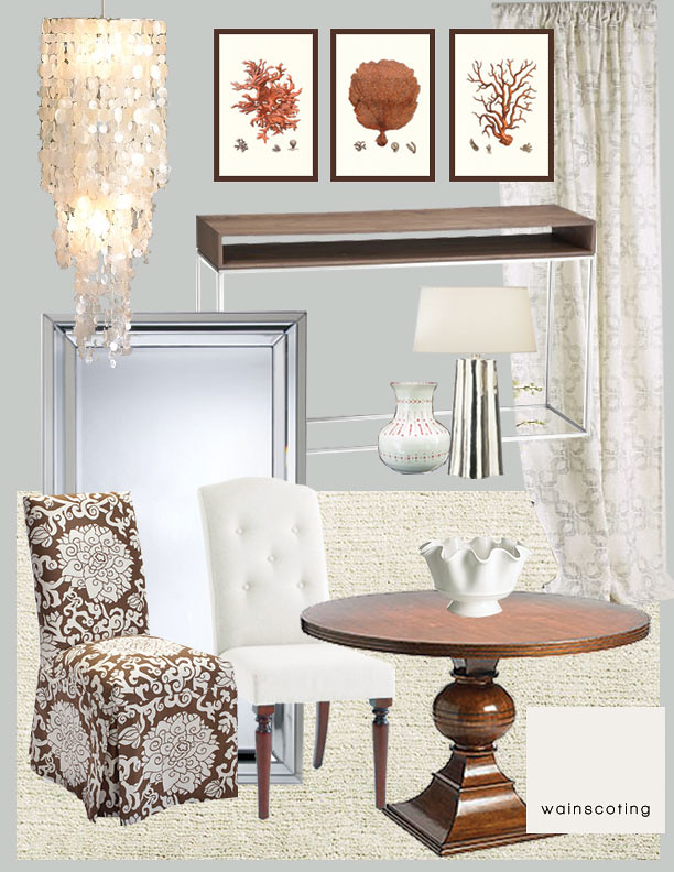
Switching gears, I've also been testing cream samples in our master bedroom.


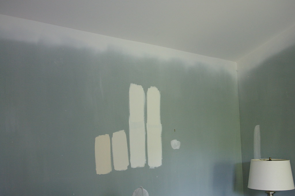
For at least a week now, I've been trying to decide between Sherwin William's Creamy (third from left) and Sherwin William's Dover White (first on the right).

I think Dover White wins. It has more yellow than pink tones, and I think it will create a nice warm, calming space. I also think it's better to go with the yellowed tone cream for warmth in the winter. Thoughts? I just went upstairs to look at the swatches again, and Dover White seems very yellow. Still undecided.

I need to prime the walls before I paint to cover the blue/green, so I'm not sure when I'll get around to that.

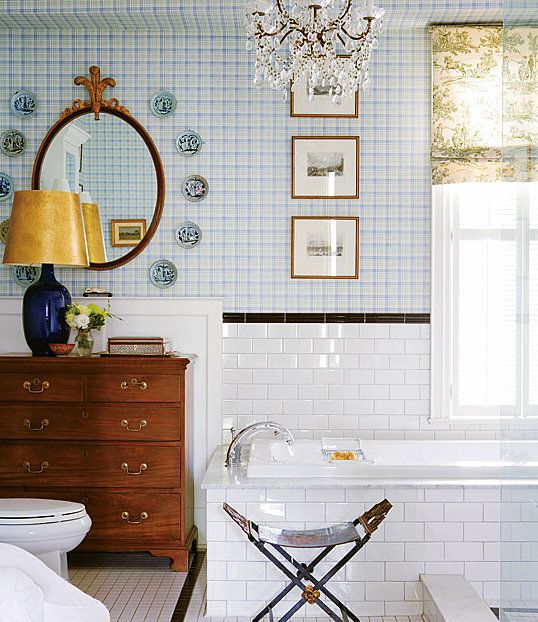
The third space I've been actively working on is our master bathroom. There isn't much to be done in there, so I'd like to finish it up soon. I need to paint, add a couple wall shelves, add new window treatments, and then I'll be done!

Here are the wall shelves I think I'll be adding:


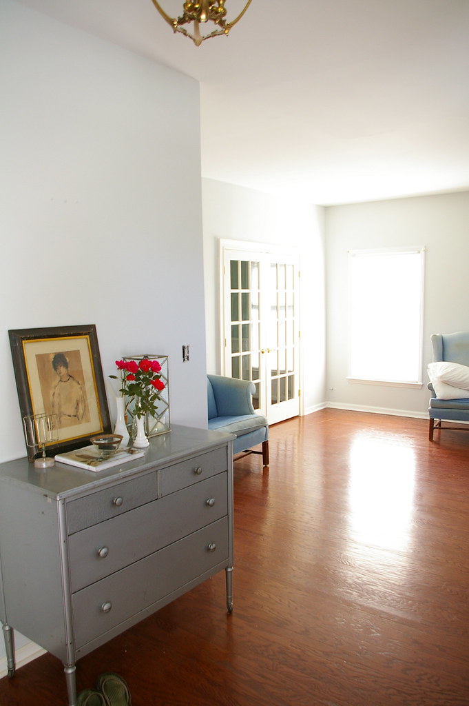
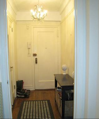
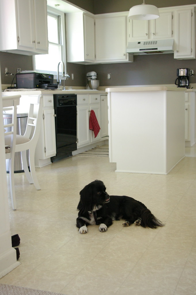
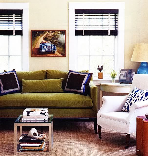
Even though our other spaces still look somewhat like a construction zone, I'm 'workin' with what I got'. Here is what our entry currently looks like:


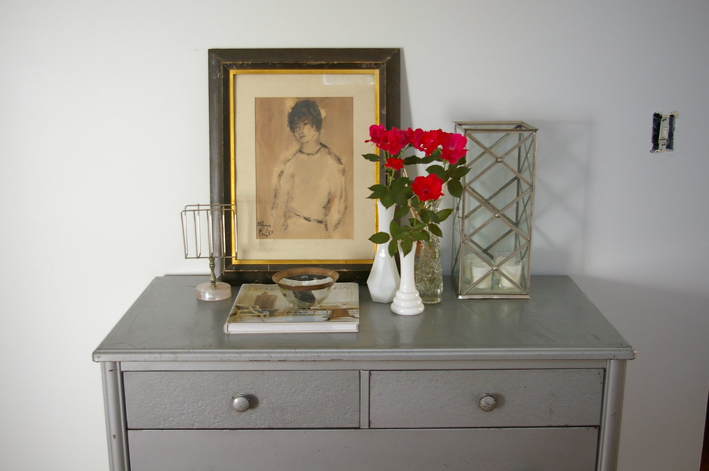
(Flowers picked from the only flowering plant we have on our property. They are a pretty color, aren't they?)

I'm debating whether or not to paint this piece black, OR have it professionally stripped down to it's original steel body. Similar to this:


What do you think? As much as I LOVE the original steel, I'm leaning towards black. I think it will contrast against the blue/gray walls better than steel. I can always sand down to original finish later down the road for a different use/room. Like a nursery!

So, that's where my head is at! Going in many different directions.

edit - I'm already getting votes for the steel! I sort of knew that would happen ;) I'm still leaning towards no steel.. here is a picture of the room. I'm feeling that the steel just doesn't "go" with the blue/gray. Please persuade me otherwise if you feel strongly for steel though!

Related Posts Plugin for WordPress, Blogger...