I'm still on West Coast time and not at all tired, so I thought I'd share some more pictures and dive into some details of the 'eclectic beach house' project.
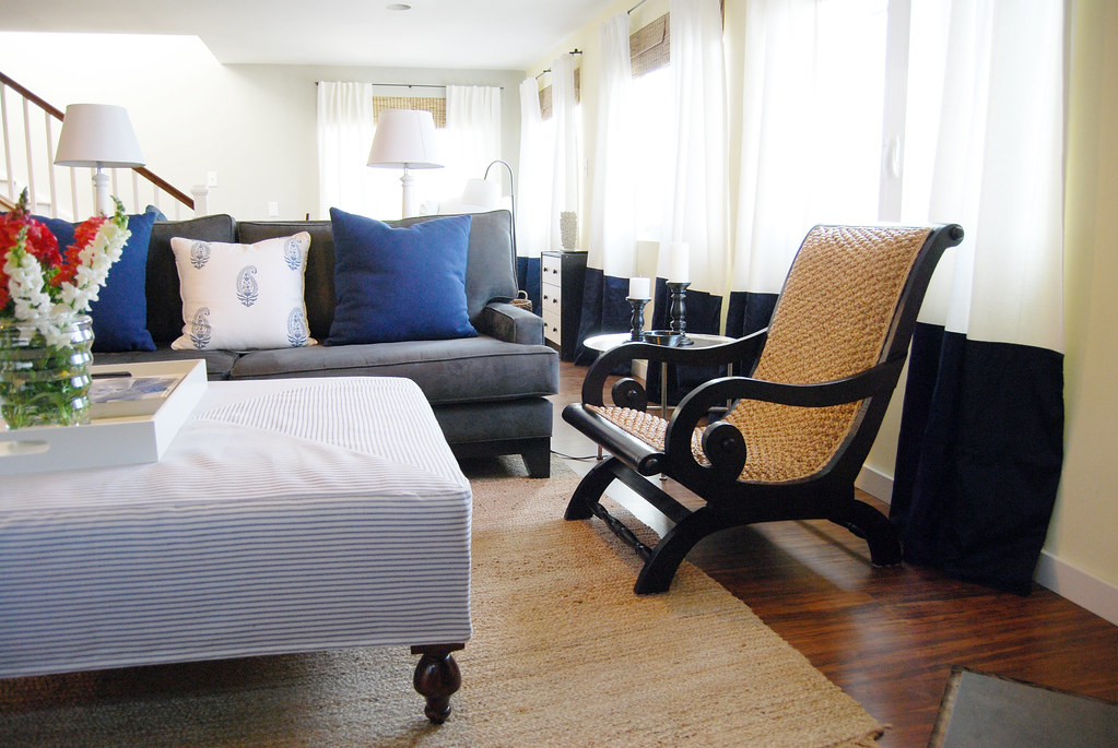
If you guessed this is the project that mixes black + blue - you are right! I love the mix of black furniture and accents with blue fabrics. It's very subtle but still noticeable.
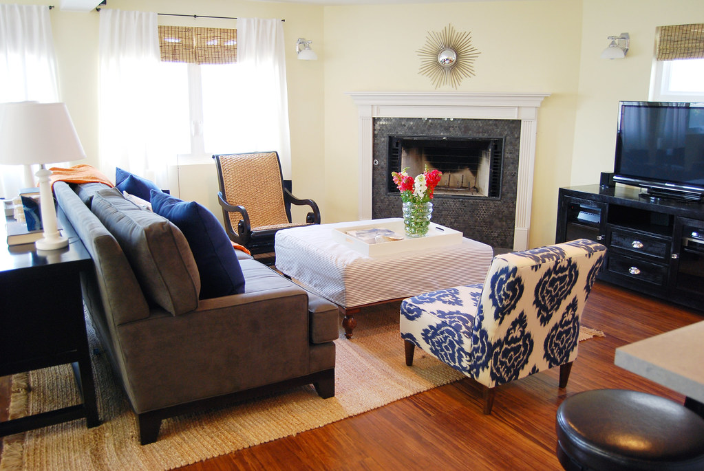
The family already started out with the light yellow walls, and a gray wall leading up to the next floor, so that set the stage with the color palette.

As you can see - the natural texture (rattan, jute, bamboo) was important for me to bring in because this house is literally on the beach. When you live so close to the beach, sure - the casualness of these textures is great - but more importantly they are functional. You don't have to worry so much about sand and the sea air.
This chair ended up being one of my favorite pieces. It was a last minute decision, on sale from Z Gallerie. But I think it fits so well in the room, and I love the lines. And my client tells me it's very comfortable!

The curtain panels are a nice light filtering panel from IKEA, and I had cobalt blue dupioni silk sewn to the bottom of them to create a bit of elegance to the room.
A couple of you mentioned you liked the oversized ottoman - this was a key piece in the room because the owners have (the most adorable ever) almost two year old son.
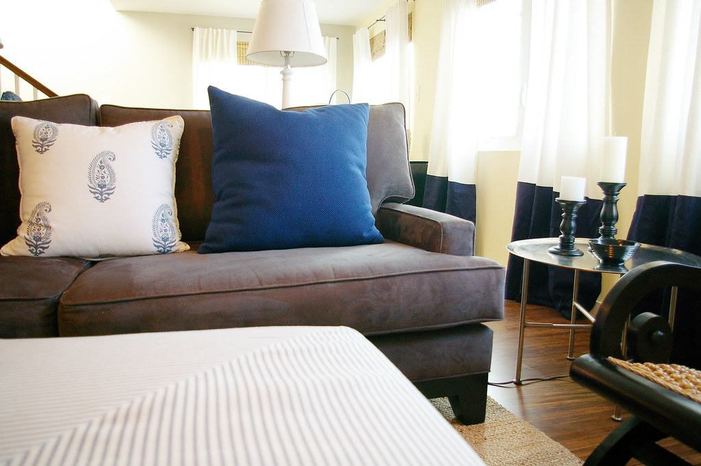
The fabric for the ottoman cover is your basic blue ticking fabric. I had it sewn so the stripes align in four triangles, meeting in the middle to form a square - creating a really cool visual interest.

I found the huge ottoman on Craigslist - I think it was only $40! It's jute underneath the cover, so it will hold up for years and years.
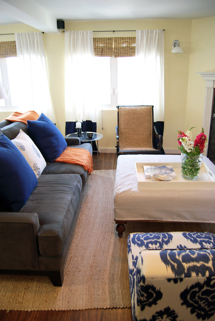

The fireplace tile is another favorite of mine. We were on the fence between carrara or gray marble. I'm really happy we went with gray. The lamps are also marble. I love mixing high (marble) and low (jute).
Here is the IKEA table!
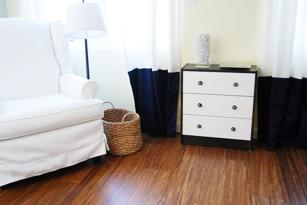
This corner isn't quite done. We need the perfect mirror for above the dresser.
This ottoman foot stool is also being delivered, along with a great patterned lumbar pillow.
We call this corner their "reading nook":

The gray wall leads up the stairs to the next floor and was one reason I brought so much gray into the room. To make the different wall color look intentional, which I think I achieved. As seen in this view..
I'll be sure to share each little detail as we add the finishing touches :)
(and a big thanks to my client who let me use her awesome new Nikon to shoot these pictures).


Lovely! Thanks for showing these pictures with more detail.
ReplyDeleteHi Bryn!!! The room feels so cozy, ready to live in. Can you show the before pics??
ReplyDeletecongrats!! you are developing a pretty style!!!
Jael
Wow. It looks just lovely. Love just about everything.
ReplyDeleteHey Bryn! Where'd you get that tray top side table? It's exactly what I'm looking for.
ReplyDeleteGorgeous. Love the black and blue together!
ReplyDeleteI love all the natural elements and the colors, great job! the floors are amazing!!
ReplyDeleteWow! I'm amazed at the rooms you have designed. When you decided to dedicate yourself to this career, I was nervous for you because its a leap that I haven't been able to make for myself yet. You should be sooo proud of yourself. You are a very talented woman.
ReplyDeleteBTW: can you give me some info on that fireplace tile. Love it.
I love it! And you didn't break the bank! So fresh....
ReplyDeleteI love it! And you didn't break the bank! So fresh....
ReplyDelete