A couple things to note:
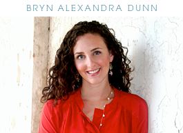
- There are links above that will direct straight to my portfolio and website. Like I mention, those will be coming towards the end of this year or early 2010.
- As you can see, I have a lot of space for advertisers now. If you are interested in advertising on my blog, shoot me an email! brynalexandra at gmail
- Wider post size, so that means BIGGER pretty pictures!
- Lots of the same old good stuff, too :)
Please let me know if there are any kinks that need to be worked out; new layouts always have funny ways of doing things differently on different computers/monitors.
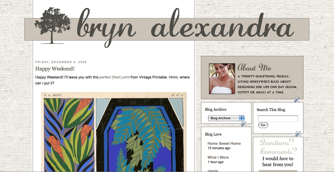
And with that, I'll leave you with one last glimpse of the old blog... we had some good times didnt we?


Love love love. You rock. All the way from Down Under.
ReplyDeleteI love it! Great job!
ReplyDeletethe new layout is looking good - it reminds me straight away of home! but more importantly? I totally adore the fact that you posted a screenshot of the old layout, because I love that layout too!
ReplyDeleteAHHHHH l-o-v-e it!!! Whew, last night when I went on, it said your blog was only open to invited readers and I was like oh noooo!!! because I don't have a google account and I just bookmark my favorite blogs! :) I'm glad to see it was just down for renovation!
ReplyDeleteI like your new layout so much better than the previous one,it's clean and airy. The welcome picture is inviting and perfect for a "professional" blog.
ReplyDeleteThe only kink i see is your blog list..the text is all on the right (inside the box), leavig a big white lost and unused space to the left.
Jael (long tome reader, first time commenter)
Bryn--looks great; very sophisticated. Can't wait to see your website and portolio pics :)
ReplyDeleteBryn--looks great; very sophisticated. Can't wait to see your website and portfolio pics! :)
ReplyDeleteLoving the new layout and congrats on forging ahead with your dream. If I were in the States (and had my own place), I'd certainly be queuing up to use your services.
ReplyDeletegorgeous! congrats... doesn't it feel so good to get a fresh look! I love it!
ReplyDeleteLove the new layout, it looks so neat and clean- perfect for your new business!
ReplyDeleteI love the new look. I have been following you for quite some time now and wanted to tell you that I look forward to reading it every morning. Have a great week:)
ReplyDeletelooks great! congrats :)
ReplyDeleteI love it! So pretty!
ReplyDeleteOne thing I notice from my computer screen (but it could just be my computer) - your blog lists float a little to the left, off of the column/border. Just something I'm seeing from my perspective.
What a great new look!
I love the old and the new you!
ReplyDeletepve
Looks great! Just wanted to let you know that your "My Blog List" strip to the right is off. All the info in the strip is half in it and half over to the right of it.
ReplyDeleteHope this helps!
It looks great, Bryn! I love the burlap background (at least that's what I'm guessing it is)! It looks very professional, sleek, and sophisticated, just like your design style. Did you make it yourself or did you hire someone?
ReplyDeleteBeautiful! I love the clean, elegant look (with the fun texture in the background)!
ReplyDeletelooks great!
ReplyDeleteYour new layout is beautiful!
ReplyDeleteOh congratulations--how exciting! I love that you have bigger pictures, although I am going to miss the beautiful linen textured background of your previous design. I can't wait to see your portifolio!
ReplyDeleteI wated to mention something that I noticed about your new design. I use IE7 btw--on your "My Blog List" column, all the titles seem to be right aligned (I think?). Or like there's two columns in the one column and the left column is blank and everything is in the right column--so it's smooshed and some of the titles are outside the box.
I just wanted to let you know because your blog is beautiful and it looks like you worked so hard on it!
Congratulations, again!
Just because I'm a nerd and can't help myself, I checked with Firefox (which my husband is constantly telling me I need to use--haha!) and your "My Blog List" looks perfect. So, maybe he is right. :)
ReplyDeleteI love the new design. The green is fab!
ReplyDeleteRachel
Looks great! Can't wait to see the biz stuff.
ReplyDeleteGorgeous, darling! Love that you are pursuing your goals--and so stylishly!
ReplyDeletejbhat
Love the new layout Bryn!
ReplyDelete*gasp* Bryn, I LOVE it!
ReplyDeletewant to come over and design mine, too? I can pay you with undying love and devotion...
Lovely and elegant - I love it!
ReplyDeleteI love the new layout design, but part of me will miss that lovely font you used to use for your name. Best of luck with your new enterprise!!
ReplyDeleteI love it!!! It's so perfectly suited to your style! :)
ReplyDeleteoh, i liked the old one better but this one is nice too.
ReplyDeleteLooks fantastic, simple and chic!
ReplyDeleteLooks fantastic, simple and chic!
ReplyDeleteI love it!!! It's so perfectly suited to your style! :)
ReplyDeleteI love the new design. The green is fab!
ReplyDeleteRachel
Your new layout is beautiful!
ReplyDeleteLooks great! Just wanted to let you know that your "My Blog List" strip to the right is off. All the info in the strip is half in it and half over to the right of it.
ReplyDeleteHope this helps!
I love it! So pretty!
ReplyDeleteOne thing I notice from my computer screen (but it could just be my computer) - your blog lists float a little to the left, off of the column/border. Just something I'm seeing from my perspective.
What a great new look!
Love the new layout, it looks so neat and clean- perfect for your new business!
ReplyDeleteLoving the new layout and congrats on forging ahead with your dream. If I were in the States (and had my own place), I'd certainly be queuing up to use your services.
ReplyDeleteLooks fantastic!
ReplyDeletethe new layout is looking good - it reminds me straight away of home! but more importantly? I totally adore the fact that you posted a screenshot of the old layout, because I love that layout too!
ReplyDelete