The living room console!
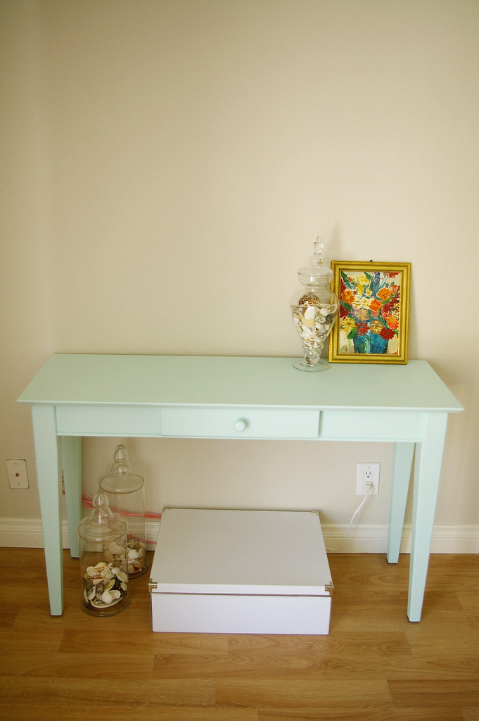
{paint = "Vintage Map" by Martha Stewart for Valspar}
I've been wanting to do this for a while... remember this post?
I'm slowly, and very inexpensively, working on updating our living room. This console is definitely a work in progress... I really want to change the wooden knob, but when I went to take it off, I found it's glued in.
Does anyone have any idea how to get our a glued in piece of wood??
I think I may have to saw it off, sand down the remnants and then drill a hole for the new hardware. That's on my to-do list.
See the white box? One thing I did was find a storage option for my husband's big, clunky surround sound receiver. I'll post more details about that another day.
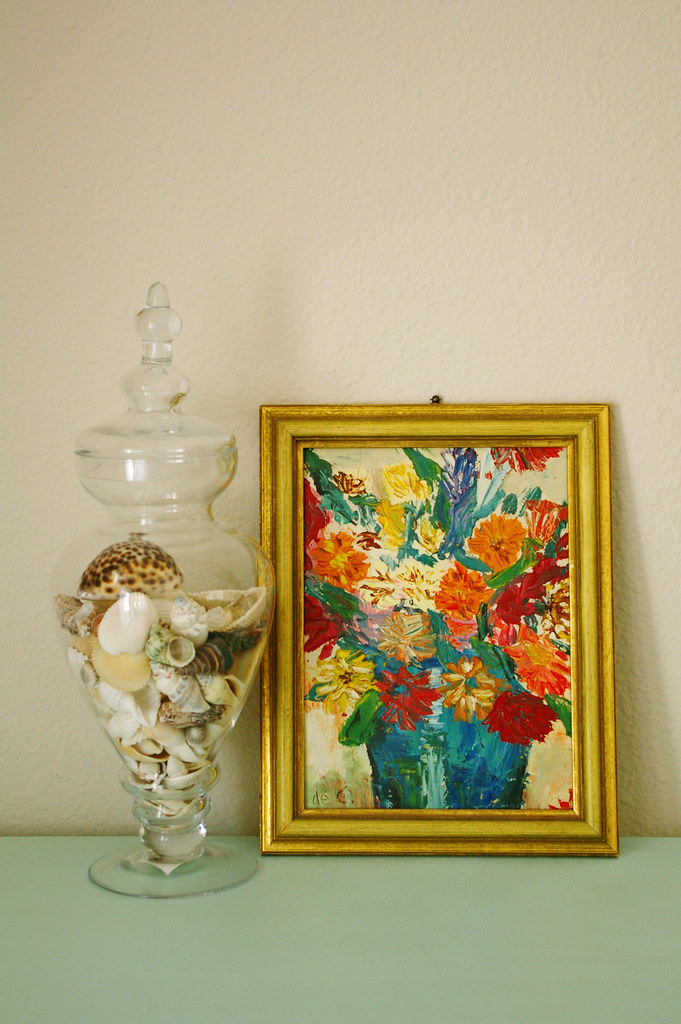
When I go to the Rose Bowl flea market, I am going to be on the hunt for a large, neutral piece of art to place on the table. I don't want it to be too bright to take away from this lovely little painting my grandmother did (above). Aren't the colors so 70's? I love it.
Now for the shot of the room.....
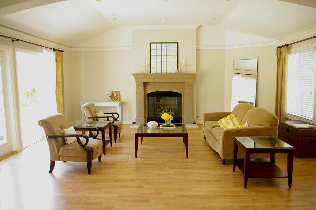
This is a serious work in progress.
Things I've done:
- Paint room
- Hung light, white curtains
- Paint console
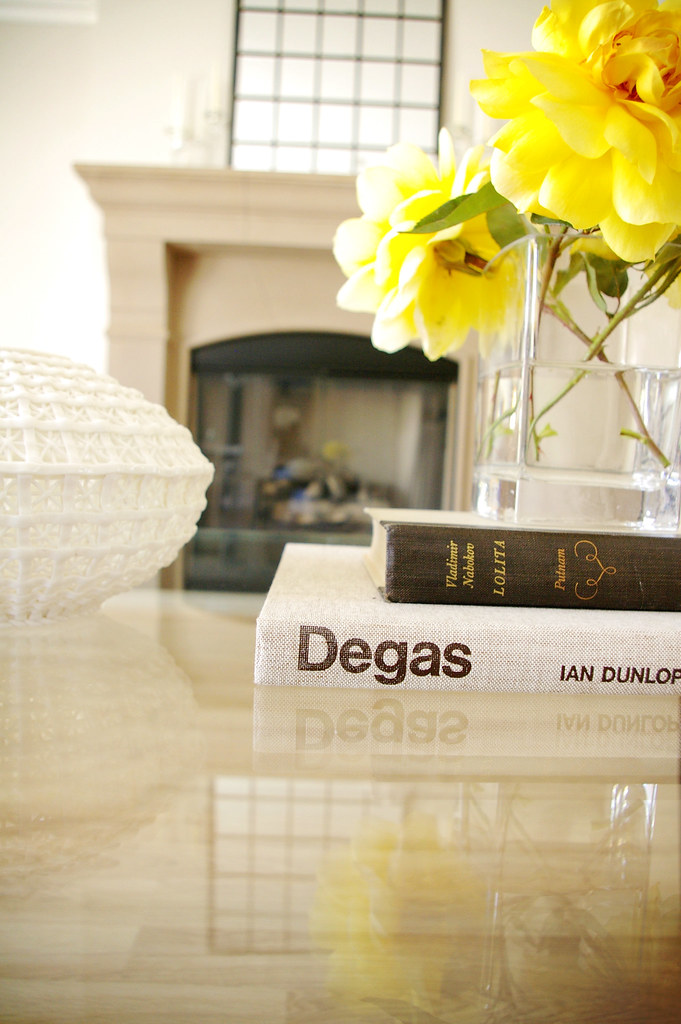
- Re-arranged mantle and coffee table accessories
- Added leaning mirror
Things to be done:
- Jute rug (for my birthday)
- Large art for console
- Make bolster pillow
- Hang the white curtains on the other side.
I have to be honest - in a perfect world, I'd create an idea board for myself and be able to go out and buy new furniture and accessories. But that's not in the budget, not now and not for a while. Each little project I've done has been around $20, and I'm definitely working with what I have.
I'm always open to suggestions for this room - like I said, it's a major work in progress, and done on a teenie tiny budget. One thing I am asking for for my birthday is the rug - I keep going back and forth about it- should I do something neutral, like an ivory jute or something graphic and dark?
I'm slowly, and very inexpensively, working on updating our living room. This console is definitely a work in progress... I really want to change the wooden knob, but when I went to take it off, I found it's glued in.
Does anyone have any idea how to get our a glued in piece of wood??
I think I may have to saw it off, sand down the remnants and then drill a hole for the new hardware. That's on my to-do list.
See the white box? One thing I did was find a storage option for my husband's big, clunky surround sound receiver. I'll post more details about that another day.

When I go to the Rose Bowl flea market, I am going to be on the hunt for a large, neutral piece of art to place on the table. I don't want it to be too bright to take away from this lovely little painting my grandmother did (above). Aren't the colors so 70's? I love it.
Now for the shot of the room.....

This is a serious work in progress.
Things I've done:
- Paint room
- Hung light, white curtains
- Paint console
- Re-arranged mantle and coffee table accessories
- Added leaning mirror
Things to be done:
- Jute rug (for my birthday)
- Large art for console
- Make bolster pillow
- Hang the white curtains on the other side.
I have to be honest - in a perfect world, I'd create an idea board for myself and be able to go out and buy new furniture and accessories. But that's not in the budget, not now and not for a while. Each little project I've done has been around $20, and I'm definitely working with what I have.

I'm always open to suggestions for this room - like I said, it's a major work in progress, and done on a teenie tiny budget. One thing I am asking for for my birthday is the rug - I keep going back and forth about it- should I do something neutral, like an ivory jute or something graphic and dark?


Wow.... you are much better at decorating than I'll ever be, lol.
ReplyDeleteYou're doing a great job!
As for the rug (and this is my non-decorator opinion)... I would go with ivory or a light color. With the dark wood furniture, I'd be afraid that a darker rug would bring your attention to that and not the light/airy feeling of the room. JMO!
oh its looking gorg!
ReplyDeleteWow it looks great. You get a lot of projects done on the weekend. All those painting jobs. You need to take a weekend trip to NY and help me! :)
ReplyDeleteI love the idea of a jute rug, but since the walls are a neutral and so is the furniture color I would love a pop with graphic rug. I think either would look great it would just be a different look depending on which one you choose.
I'm de-lurking to post a comment! Your home is just beautiful. I personally would change the mirror above the fireplace. It just needs something different, maybe some sort of white architectural piece? Also, have you ever thought about painting the fireplace bumpout a different color, like a darker tone of your walls? I think that would look neat. Keep the pics coming!
ReplyDeleteStunning, Bryn! The console, your grandma's painting, the wall color...I love it all. I can't wait til you make that gorgeous fabric into a bolster. As far as the rug, I'd stick with light. I love how airy and fresh your living room is, and I feel like a dark graphic rug would take away from that.
ReplyDeleteWow - I love that console. What a pretty color!
ReplyDeleteOooo, I love the color of the console! So relaxing, creamy and beautiful!! What about a rug near the same color as the console? I think it would look really nice with the pops of yellow you have; it's neutral enough not to overpower the room, but it would add a little color so everything wasn't neutral. Just my thoughts for what they're worth:-)
ReplyDeleteSo pretty! I love the painted table in the watery blue! And great table vignette shot!
ReplyDeleteI would love to see a bold stripe or graphiz rug, just because the rest of the room is so neutral, but that is just my two cents! Love the wall color!
ReplyDeleteOh, I love it..
ReplyDeletelove the pop of yellow it adds so much
ReplyDeletedo have a specific rug in mind
Your living room looks great and I'm so inspired by how much you've been able to do on a tiny budget. I always feel like I need to finish a project as soon as I start it but because I don't have the funds for a complete overhaul I don't do anything. The result is me always talking about doing something but never doing it. You've proven to me that it can be done well even in baby steps. Thanks for the inspiration!
ReplyDeleteLooks great! I would pick a graphic rug as well.
ReplyDeleteI would add some color/pattern with a rug since everything else is so neutral.
ReplyDeleteooo, graphic + dark (would be really cool if it had a hint of the blue from the newly painted table)! =)
ReplyDeleteBeautiful color for the table, it's perfect! You are such a talented decorator.
ReplyDeleteI would go with a dark graphic rug as well! Can't wait to see how it turns out.
Wow, I love that color, it looks so pretty! I cant believe you are doing so much with so little, it really is amazing!
ReplyDeleteMm, I'm going to have to agree with the comment from The Mrs. Great idea. Nice and light, and I also adore robin's egg blue.
ReplyDeleteIt's looking beautiful in there, and I love that you are willing to post your room as a work in progress, and not wait until it's done. We all know what it is to be working with a teeny tiny budget, I think.
jbhat
Your console is so beautiful! That's the color we were going for in our Master...unfortunately, it turned out MUCH brighter in person than it did on the swatch (Jade Sea, by Kilz). I just have to say that you have a G O R G E O U S home and I love seeing what you had to it each week! :)
ReplyDeleteI love the color you painted the table> it's awesome.
ReplyDeleteI had wooden knobs on our hutch before I painted it last week. I used a flat head screwdriver to pop it off and then bought new hardware that covered the area, so I didn't have to sand it down. It worked out pretty well
I would love to see a pattern since there are alot of neutrals or something in some other tone...
ReplyDeleteI know you will find something great.
It looks great. I really like the new paint color. It looks so bare though. Just some suggestions from a non-professional. Love the idea of a big jute rug with a smaller rug in an accent color (looks like yellow might be your accent color) on top to ground your seating area. Add pillows to your two chairs. Move the leaning mirror. You have too many mirrors. I would put the mirror you currently have over the mantel over your console then layer your smaller colorful piece of artwork over that. Then get a great painting at the flea market for over the mantel. You should also look for a more interesting table at the flea market to replace your existing side table next to the sofa. I think it would make your new, very cute, blue console table fit in better!
ReplyDeleteTHat is a really lovely room...even as a work in progress! The light, the space and the projects that you have done are so pretty! I think I could just live in that room!
ReplyDeleteI'd love to see some more pattern in the living room! light or dark would be your preference, whether you'd like to keep the airy feel or make a statement. IMO, jute might blend with the colour of your floors a little too much.
ReplyDeletenice bones and nice paint color but the room lacks a lot of personality IMO and color, it looks really bare and unfinished. I could see pops of bold color (like your yellow) and more artwork, rugs and accessories really make a difference:)
ReplyDeleteI love that fireplace! Wow. And the layout of your furniture is perfect for the space. I'd love to see some pattern and a pop of color in there. I think you could use a nice piece of artwork above your new robin's egg blue table...and I agree with the earlier commenter about a patterned rug. Overall, great job though!! Love it!
ReplyDeletehi there, i love your blog and your photos, you have a lovely home:) i was wondering about the details you promised were forthcoming on hiding your husband's receiver system in that box! i too suffer from the huge boxy receiver system problem and i wanted to see how you fixed it.
ReplyDeletethanks.