Well, as I mentioned earlier the time has come to finally put tile in our bathrooms and I'm nailing down some final plans.
Here is my inspiration for our guest bath from Timothy Whealon:

Yup, totally neutral and all whites & creams. I've probably lost half of you who are thinking BORING!!!! Well, what can I say... I love an all white bathroom!
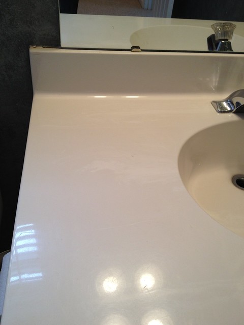
I have a small budget to work with for updating both of the bathrooms upstairs so I am keeping all of the big items for now. Who knows, maybe later down the road I will replace the countertops, or maybe I won't. There is currently a cream faux marble countertop in the bathrooms and I don't hate it.

Anyway, here is the design board for the guest bath:

White Dove by Benjamin Moore on the walls (a very soft creamy white). A bright white semi-gloss paint on the vanity and trim. And I think I'll bring the same tile that's currently in our laundry room upstairs into the guest bath with light gray grout. I want a very organic/linen-y shower curtain. I'm considering this one from Restoration Hardware maybe in Ivory or Fog (I still need to look at them).
So that's where I am with the guest bath! I'm going to look at tile tomorrow and start pricing out the floors. I can't wait to have these two rooms done! They are definitely our home's dirty little secret right now... wait until you see the before pictures!


I think your bathroom will turn out great. I too love all white bathrooms. I am usually drawn to bold color, but when it comes to kitchens and bathrooms; I love the clean, crisp all white look.
ReplyDeleteSamara
Hey---you can't go wrong with the neutral elements you chose!
ReplyDelete(Says the girl with the seafoam green and gray bathroom...)
http://thenestinggame.com/2011/08/18/nest-tour-minty-fresh-bathroom/
White bathrooms are always so clean to me and never out of style. You can always punch it up with accessories and towels!
I think it is beautiful, not boring. It is classic. Kudos, Bryn!
ReplyDeleteBryn, I actually renovated my brother's bathroom with the same tile you are looking to use. Check out the before and after here:
ReplyDeletehttp://foreverthehostess.blogspot.com/2011/06/bathroom-before-after.html
We also kept things all white. My original thought was to make the grout grey or a like sand brown, but the more we looked at the white tile, we knew we wanted it to look crisp white, so we went with white grout (which can also be bleached!).
Can't wait to see how your bathroom turns out!
You didn't lose me, I love this! You want to feel super clean in a bathroom, and there's no better color for that than white! I'm crazy for that grey grout.
ReplyDeleteMarissa
www.roost-home.blogspot.com
Love the plan! I just wanted to let you know that Lowe's sells a similar faucet for just at $100. ( I don't know if that would be a more budget-friendly option or not). My husband installed it in the powder room just off our kitchen. It works great in there, but I'm not sure how it would work for doing things other than washing hands (ie. rinsing tooth brushes and razors) because it doesn't have a pressurized flow like other bathroom faucets.
ReplyDeleteGreat board. You can always add color later with accessories, etc. if you decide to go that route. You will never regret having an all neutral base. I love it.
ReplyDeleteI smile every single day when I use my white and light grey bathroom:
ReplyDeletehttp://homewithcatherine.blogspot.com/2011/11/home-anniversary-bathroom.html It's so clean and lovely now, and it feels huge despite it's tiny footprint. Looking forward to seeing how yours turns out :)
Where is the faucet from?
ReplyDeleteI think nuetral is great. You can always add punches of color in the accessories.
ReplyDeleteCan I please beg you DO NOT USE WHITE TILE ON THE FLOOR - we have this in our circa 1960 home and I honestly wish the floor was pink like the rest of the tile and tub and toilet (yep, it's a gem!). The floor constantly has dirty footprints or paw marks from dogs. it's TERRIBLE!
ReplyDeleteTrish
www.mash-upchic.blogspot.com
Although my floor plea sounded desperate, (!), I love the rest of the idea. White bathrooms are the best!
ReplyDeleteI love that idea. Plus you can always change the shower curtain and accessories for a completely different look. It will be like a blank canvas! BTW...I LOVE that faucet!
ReplyDeleteI love an all white bathroom too. Just add a great piece of art and some fresh flowers and you have that pop of color! By the way, I've used that tile before and had them grout it with black. It looked fantastic and not as "home depot" (not that there is anything wrong with home depot!). Anyway- I like everything you picked...can't wait to see the reveal!
ReplyDeleteI just bought that shower curtain from RH and I LOVE it.. it's really simple and gorgeous, you'll like it alot.. I'm with you on the all white and neutral..it's so clean and fresh that way!
ReplyDeleteLove the design board, and can't wait to see the end result!
ReplyDeleteVery nice! I like neutral rooms that I can change around frequently with shower curtains and accessories. I have seen similar light fixtures at Lowes for a very reasonable price.
ReplyDeleteI don't think it's boring at all- I think it's very classic. Bathrooms (and kitchens) just date so quickly! I think it's smart to do something simple and beautiful like you're planning. Good luck!
ReplyDeleteI love your plan! White bathrooms are beautiful and always look fresh!
ReplyDeletebeautiful finishes and love the bm paint colour!
ReplyDeleteI love a clean bathroom, and it is so much easier to know if your bathroom is not clean if you can see the dirt when it arrives. Might sound crazy, but having a floor where the dirt blends in drives me crazy. I always think, "wouldn't I want to know if I was stepping nice and clean out of my shower onto dirt?" So yes. White crisp and clean is beautiful!
ReplyDeleteI love the look! I know it is so easy to get caught up in getting all fancy schmancy when you are constantly exposed to beautiful and bold designs. I think the important thing for real people on a real budget is to do things in a style that are really going to last the test of time (or until we move or can afford to do some ridiculously amazingly expensive tile!). I can't wait to see the work and finished project of this space!
ReplyDeleteLove it!!! I love how whatever you put your hands on is so classic and timeless. I wish I had your gift!!!
ReplyDeleteIt's a perfect, timeless look.
ReplyDeletejbhat
White dove....the perfect soft white. My whole house is painted that color. Those knobs from RH are the bomb. I used them in my kitchen. I think this is going to be the perfect makeover.
ReplyDelete