In Colorado while thrifting with my bff Erin, she came around the corner with this book thinking I would like it. She knows me well... I took it home with me.
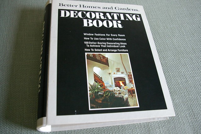
Better Homes & Gardens Decorating Book... from 1975!
It's amazing how things that are old are new again. There are so many images in this book that could be straight out of Lonny or Elle Decor.
I love this room... the little stools and the traditional black chair (sort of like mine!)
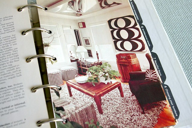
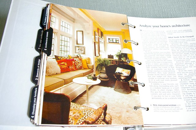
Love the bold patterned chair below:
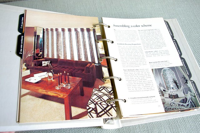
Awesome gallery wall! Awesome wood ceiling!
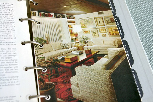
Could be right out of Elle Decor..
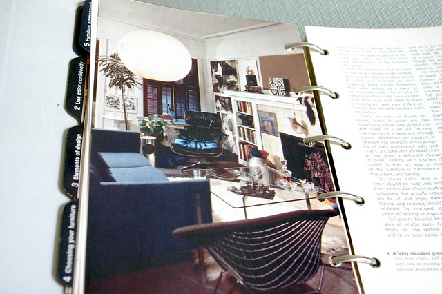
Traditional, but still contemporary.
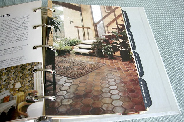
These floors (below) are awesome!
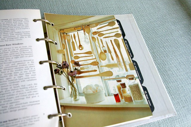
A really cool "art installation" in a kitchen..
There was definitely some ugly... like the chapter on wood paneling.
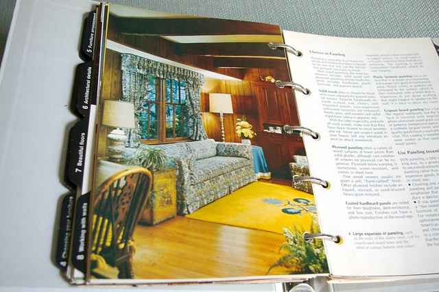
These next two rooms would surely give me panic attacks.
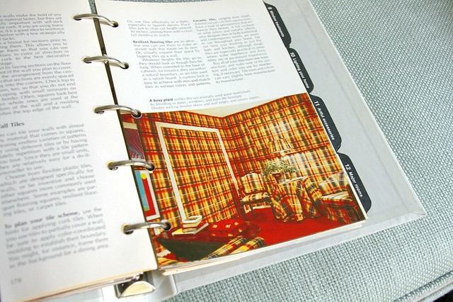
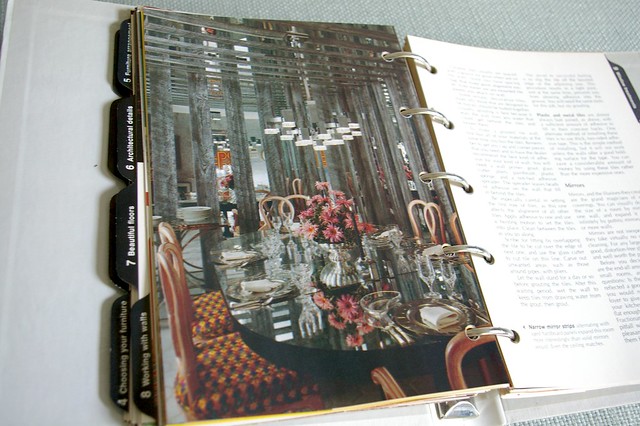
Aside from the fun pictures, there is a lot of good info in the book!
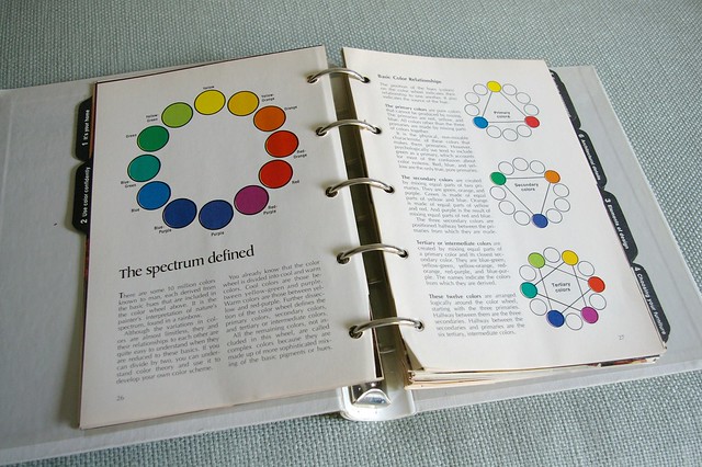
I'll definitely have to sit down and learn at thing or two!
ps - Jenny found the same book but a different year and blogged about it here!


I don't know why but "chapter on wood paneling" totally cracked me up. Fun post Bryn!
ReplyDeleteamazing that sometimes it's just the photography that dates the rooms!
ReplyDeleteI have this book too! It's a great source of inspiration for me. I wonder how long it will take for wood paneling to come back? Hopefully forever.
ReplyDeleteHow fun! I have an old old Laura Ashley decorating book that has all kinds of directions and patterns from headboards to pinch pleated drapery. Love your pictures!
ReplyDeleteI love the way things come and go in cycles. I like to think we improve upon styles every time we recycle them (which means no more orange plaid walpapering!) What a neat find.
ReplyDeleteThat is awesome. I also have a book like this, binder and all - but it's from 1956. Soo much mid century goodness its awesome. I took a few pics with my phone...
ReplyDeleteLove it! I bought those chairs from the last photo a few weeks ago, lacquered them white and covered with ikat and sold them in my store in a flash. Even the "ugly" shot had something pretty in it!
ReplyDeleteThe best design is timeless. Some of these rooms are just stunning, and I spy some of my favourite pieces of furniture. In fact I'm awaiting delivery of my own Platner chair from Knoll in the next couple weeks.
ReplyDeleteWhat an amazing find! So lucky!
ReplyDeleteHi Bryn, Found you from Houzz. Loved the candle list - I'm a sucker for a great candle too so lots of new stuff to try. Thank you! I had to laugh at the shower curtain post. Before I read the comments I kept looking at that photo thinking "does that say Fortuny?!" You lucky duck!
ReplyDeleteWhat a fun book!! That's a great find. I never think to look at the books. Thanks for the reminder!
ReplyDeleteJust goes to show how timeless those trends were. What a fun find!
ReplyDeleteJust visiting for the first time. Love what I see! Just signed on to subscribe
So funny! I was just reading your blog, and simultaneously noticed that West Elm has such a similar bold black and white print ottoman as in the chair above :
ReplyDeletehttp://www.westelm.com/products/essex-dhurrie-ottoman-g473/?pkey=climited-edition-furniture
Style is cyclical!
I love seeing all the old/now new designs!!! I mean yes...there was some bad stuff back then....but there is some bad stuff now!
ReplyDeleteWondering where I can find flooring like that. I have been looking all over and can't find it. Let me know if you have a source.
ReplyDelete