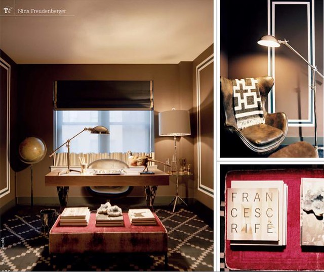
It appears that the moulding on the walls were painted with a teal middle. I love this! It really finished this room.
This concept is nothing new. I'm sure you've seen it done a lot on HGTV and on blogs, but I really like it. Here is another example from Lonny:


If you watched Design Star, you'll remember they did it in this room:

There is one thing I really like about this - artwork/mirrors can overlapp the "moulding" (as seen in the Lonny picture with the couch). You can't really do that with the depth of traditional moulding.
This is on my design bucket list - I hope to do it someday!


I have always loved that swing...to afraid my boys would make huge trouble with it!
ReplyDeleteI really love this look. It really adds dimension to a solid color wall. I would love to do this in my own home.
ReplyDeleteThat's such a great trick, and one that even renters can copy.
ReplyDeleteI love it btu then I am bias because I did it in my own home! http://courtneyoutloud.wordpress.com/2010/08/20/music-room-reveal/
ReplyDeleteWow, great catch Bryn! I don't think I would have ever noticed that color change detail. Thanks for pointing it out, it is a really nice design element.
ReplyDeleteI love the blue on the bedroom walls! I'd like to do that throughout my house!
ReplyDelete