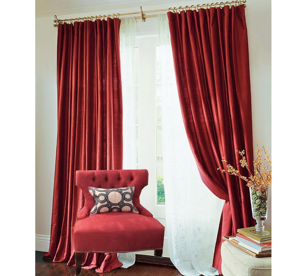
{photoshop mock up}
ps - if you are looking for some great red silk curtains, check out Smart Bargains. Two panels for $99!
________
Update:
For my own sake (education?), I went through my inspiration folder to see if I could find any other tone-on-tone examples (window treatments the same color/tone as furniture in the room).
Here's what I found... enjoy!
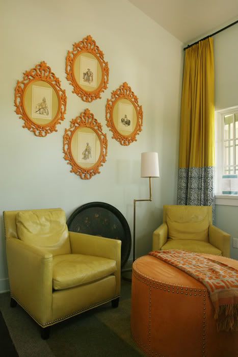
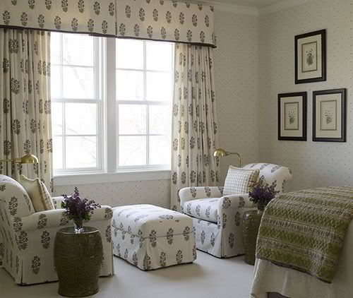
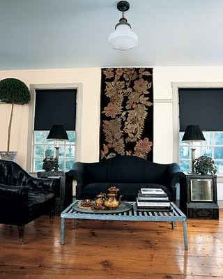
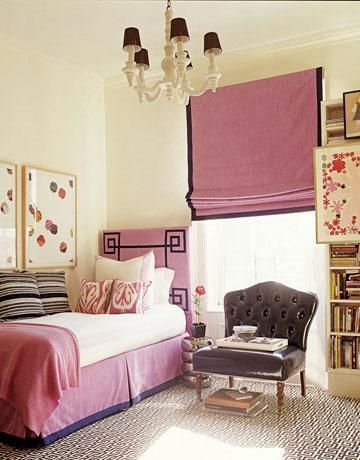
If you have any other inspiration, please do send them my way!


I love that tone of red.
ReplyDeleteCan not wait to see this room!
I think I'd need to see the entire room before giving an opinion, but IMHO, contrast usually looks better.
ReplyDeleteYou are such the discount shopper! Can't wait to see the final pics!
ReplyDeletered is a hard hard hard color ... and i'm with karen, imho, contrast looks better. i think i'd add a bottom panel to the red curtains in the same fabric you use for the accent pillow on the chair. at any rate, i'll be interesting to see what the finished result is ... red is a fun color!
ReplyDeleteHey! I put up almost the exact same shade of floor length panels as the walls in my living room. Both light greigy-taupe, the curtains have that linen texture. I have not made up my mind completely if I like it yet, but its not the tone-on-tone that bothers me....I'm a sucker for subtle layering of the same shade. Here's one of my blog posts that has a pic of it, scroll down (it's long). Good luck, girl! You're doing awesome:)
ReplyDeletehttp://pewterandsage.blogspot.com/2009/06/travelling-butterfly-2-revenge-of.html
Reminds me of bridesmaids or of a suit - matching is much more powerful... love the look.
ReplyDeleteHmm.. *searching through files for tone on tone rooms..* Will def. send them your way if I find any!
ReplyDeleteGotta love smartbargains!!
LOVING YOUR INSPIRATIONAL IMAGES!!! awesome!
ReplyDeleteOh my goodness that red pairing is pure sex.
ReplyDeleteLOVING YOUR INSPIRATIONAL IMAGES!!! awesome!
ReplyDelete