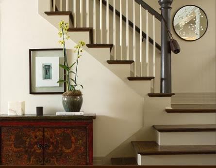
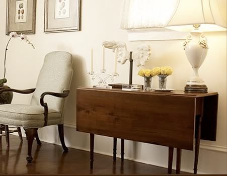
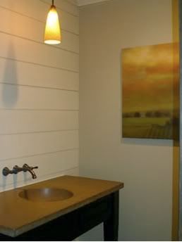
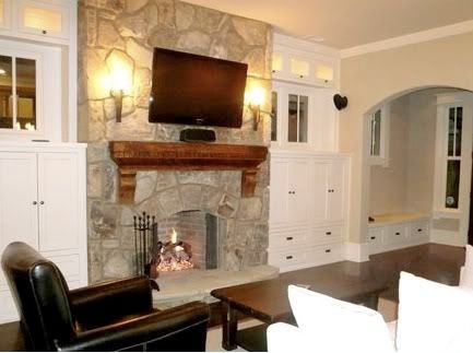
The collections of photos I recently saved have come from a number of sources, but I have to say my favorites came from Howard House Interiors. If you remember, Kerry Howard was a contestant on Top Design on Bravo TV. I never really noted his designs as ones that I would lust over, but I think he was voted off much too early....
I regress. The point is, he's an amazing designer and I had to share these inspiration photos with you. My favorite part about his designs: they are simple. Everyone knows I'm a clutter-phobe.
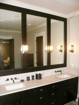
So, I don't know if this kitchen is my favorite...
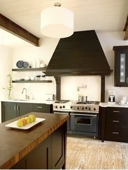
Or this kitchen. They are both amazing.
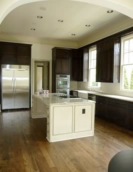
I never thought I would like dark kitchen cabinetry before finding these images. I'm sold.




I adore that fireplace and the first kitchen... beautiful!
ReplyDeleteThose entry ways are awesome - I also start to hyperventilate with too much clutter.
ReplyDeleteLove these shots they all look simple yet homey!
ReplyDeleteLovin' these rooms. I too hat clutter!
ReplyDeleteWow Bryn! The new blog layout looks fantastic!!!!! Great job!!
ReplyDeleteI love that entry way (picture #1)...
ReplyDelete